Embarking on the journey of interior design is a thrilling exploration of creativity and self-expression. At the core of this endeavour lies the art of selecting a perfect colour palette, where every hue becomes a brushstroke in the canvas of your living spaces. Designers, with their keen eye for aesthetics, have honed a set of tricks that elevate the process, transforming it from a task into an art form.
In this comprehensive guide, we unravel 10 designer secrets that promise to be your compass in navigating the world of colours, guiding you toward the creation of spaces that not only reflect your personality but also embody a timeless, harmonious design. Let’s delve into the nuances of crafting the perfect colour palette, where each shade tells a story, and every room becomes a chapter in the novel of your home’s design journey.
Embark on your colour journey by delving into the intricate world of colour theory. Understand the colour wheel’s nuances, the relationships between primary, secondary, and tertiary colours, and the psychological impact of various hues. A thorough grasp of colour theory lays a foundation for informed and intentional colour choices.
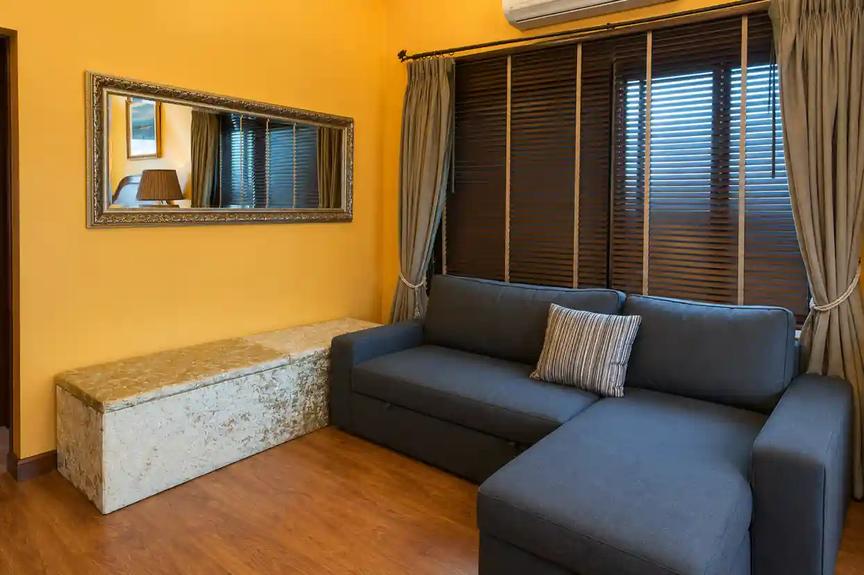
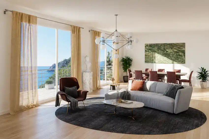
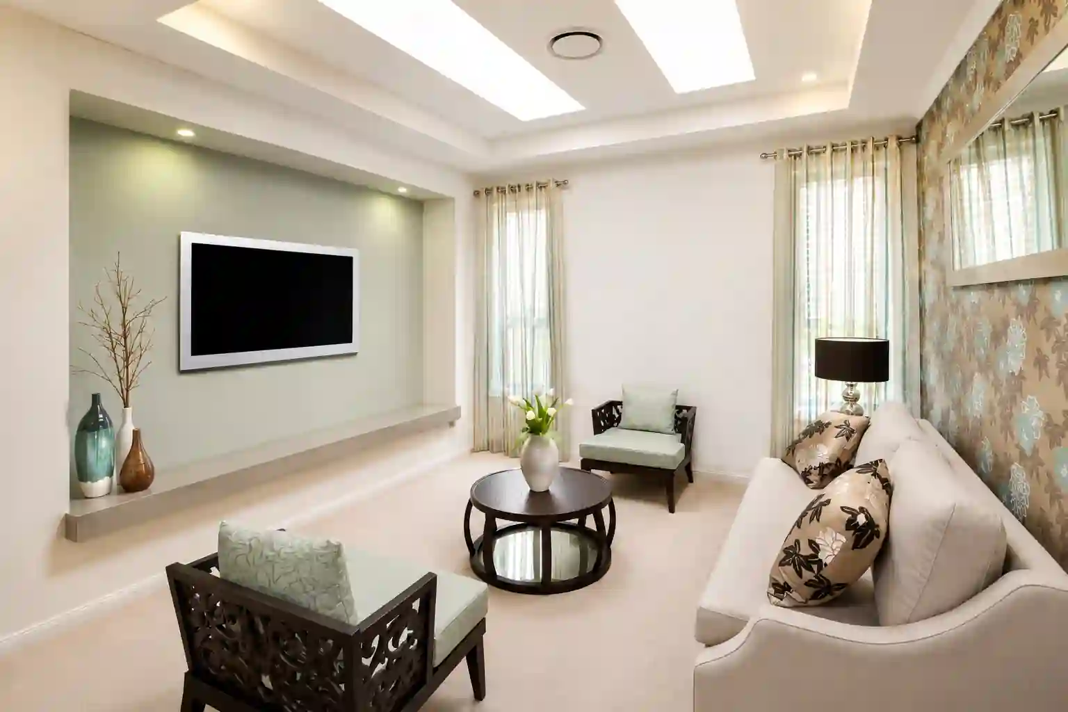
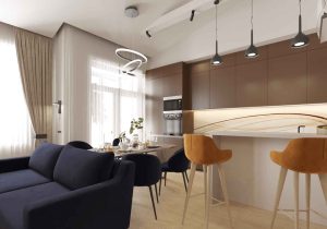
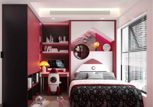
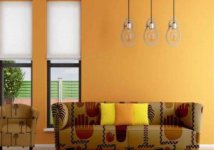
Tailoring your colour palette to the unique requirements of each room involves a careful consideration of function and mood. Explore the calming influence of blues in the bedroom, where tranquillity is paramount. Harness the vibrant energy of reds in the kitchen, fostering an invigorating atmosphere. Embrace the timeless appeal of neutrals in the living room, providing a versatile canvas for diverse design elements.
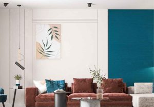
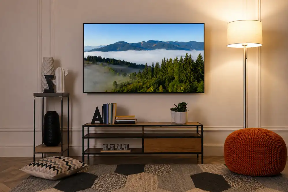
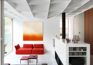
Accent colours serve as the punctuation marks in your design narrative, drawing attention to specific elements and adding layers of interest. Strategically placed accent colours through furnishings, artwork, or accessories can be powerful focal points, injecting personality and vibrancy into your chosen colour palette.
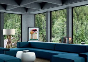
Achieving balance in your colour palette involves the harmonious interplay of warm and cool tones. Understand the emotional resonance of warm hues like reds and oranges and the calming effect of cool tones such as blues and greens. The juxtaposition of these elements creates a dynamic, well-rounded atmosphere within your living spaces.
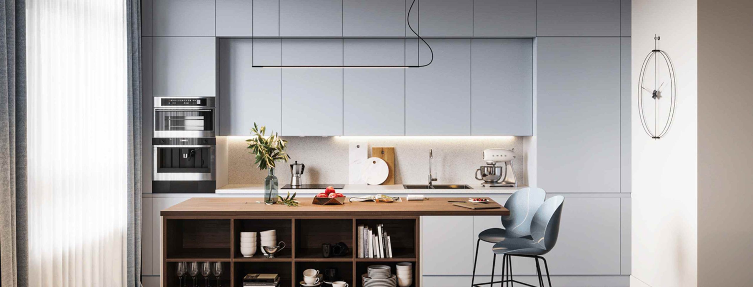
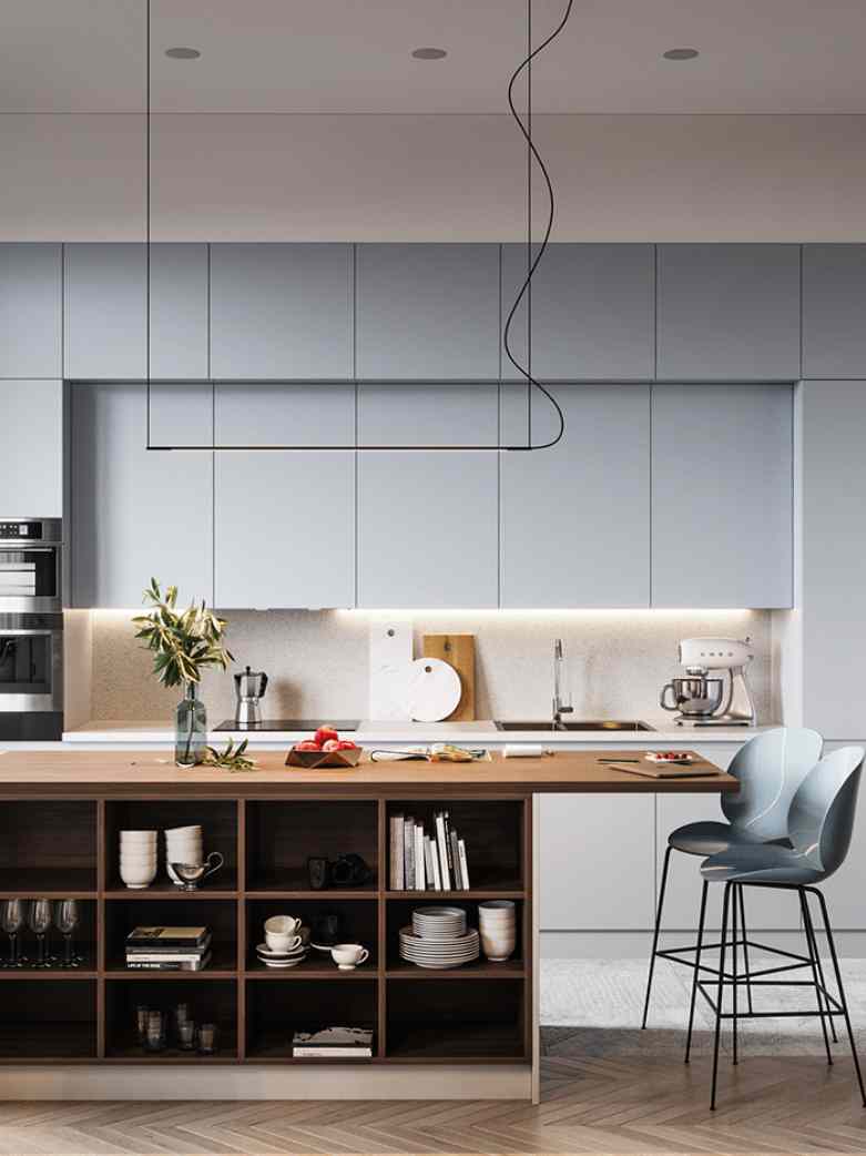
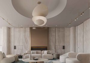
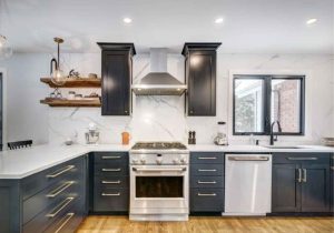
Neutral tones act as a sophisticated backdrop, providing a canvas for versatility in design. From crisp whites and greys to earthy browns, neutrals offer a timeless foundation that allows for seamless adaptation of styles, textures, and accent colours, ensuring a design that stands the test of time.
Elevate your colour palette by introducing patterns and textures, adding depth and visual intrigue to your space. Experiment with textured fabrics, patterned wallpapers, or statement rugs to create a multi-dimensional design that engages the senses and brings a personalised touch to your interior.
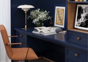
Simplicity often lies in restraint, and the rule of three is a powerful guide for maintaining a cohesive and visually pleasing colour palette. Limiting your palette to three main colours can be applied to furniture, accessories, or even wall colours, fostering simplicity while ensuring a well-balanced and aesthetically pleasing design.
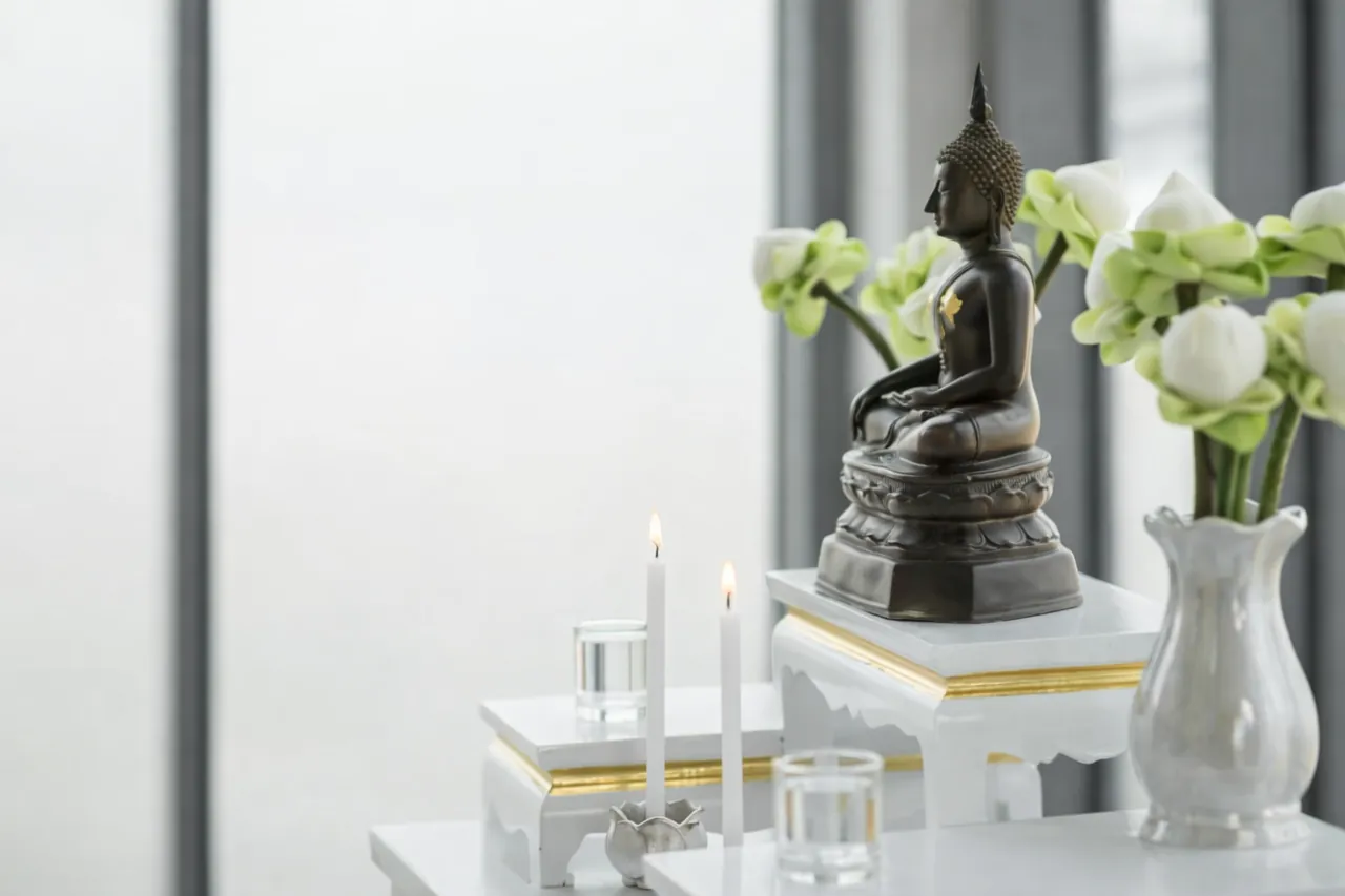
Connect with nature through biophilic design, integrating earthy tones such as greens and browns into your colour palette. This approach not only brings a calming and revitalising atmosphere but also nurtures a deeper connection with the natural world, enhancing the overall well-being of your living spaces.
Delve into the sophisticated allure of monochromatic colour schemes. Explore the various shades and tones within a single colour family, creating a refined and elegant look. This approach adds depth to your design without overwhelming the visual senses, allowing for a cohesive and stylish expression.
Recognising the impact of lighting on your chosen colour palette is pivotal. Natural and artificial lighting conditions can significantly alter the perception of colours within a space. Experiment with different lighting fixtures, placements, and intensities to enhance the vibrancy and mood of your chosen hues, ensuring a dynamic and well-balanced design.
In the realm of interior design, the culmination of thoughtful decisions, artistic instincts, and designer tricks brings forth spaces that resonate with personal style and transcend mere functionality. Crafting the perfect colour palette is not merely a task; it’s a narrative woven with the threads of emotion, personality, and timeless elegance.
As we conclude our exploration of these 10 designer tricks, envision your living spaces as more than physical locations—they become canvases where memories are painted, and emotions are expressed through carefully chosen hues.
By incorporating these insights, you embark on a journey where every colour becomes a note in a harmonious symphony, creating a home that is not just beautifully designed but deeply resonant with your unique story. May your design adventure be filled with creativity, inspiration, and the joy of seeing your vision come to life in vibrant, perfectly curated colour.