You finally get the keys to your new apartment. But when you look at the floor plan, something feels off. The kitchen sits in the north, the bedroom opens to the east, and the entrance faces a direction you never planned for. By the time you notice, it’s too late. The walls are fixed, the layout is set, and changing it isn’t an option.
This is the gap between Vastu guidelines and modern living. Vastu suggests ideal placements, but builders prioritise efficiency and optimisation. This is where Vastu colours for homes become a practical design tool. When direction cannot be physically changed, colour can help adjust the space. Designers rely on a Vastu colour chart to choose tones that calm and stabilise various corners of the home.
Let’s take the example of Mumbai high-rises. In Mumbai, apartments are stacked vertically and often aligned toward views or ventilation. A living room may face west because that side catches the sea breeze. That means room directions fall into place according to the structure rather than Vastu recommendations.
Since interior designers in Mumbai cannot make any structural changes, they instead focus on introducing Vastu colours for homes. Colours have a strong psychological impact and can be instrumental in stabilising a room. Certain tones calm the space, others add warmth, and some make a room feel grounded. Used correctly, colour becomes a subtle corrective element.
When the direction of a room cannot be changed, colour helps balance the space rather than intensify the directional energy. Designers usually refer to a Vastu colour chart to guide these decisions.
Below are practical ways colour can be used when room placement isn’t ideal:
The south-west corner traditionally supports stability and is best suited for the master bedroom. But in many apartments, this space becomes a study room or even part of the living area. In such situations, the south-west colour, as per Vastu, should create a grounded feeling.
Designers typically suggest:
These colours visually anchor the space. In some Bangalore homes, designers combine these tones with wood textures or warm lighting, so the room feels balanced rather than heavy.
The south-east direction carries strong energy because it is traditionally associated with fire. Ideally, kitchens are placed here. But apartment layouts often turn this area into a bedroom. The south-east colour, as per Vastu, should therefore soften this intensity.
Suitable shades include:
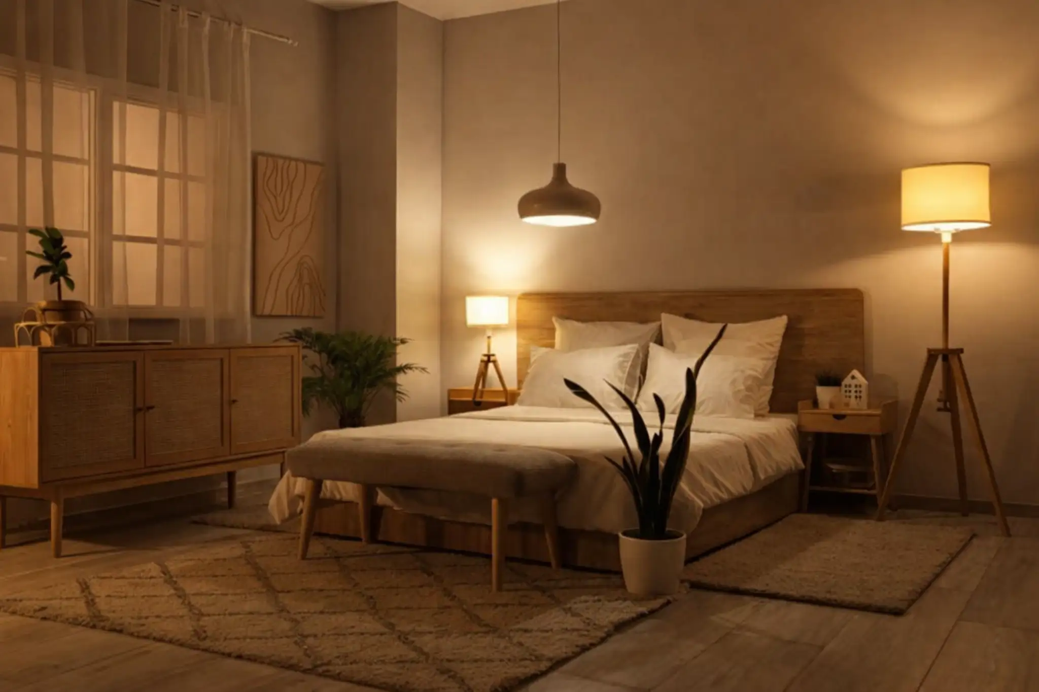
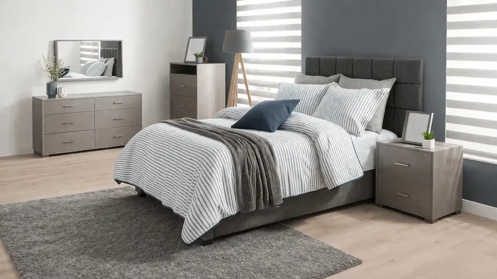
When homeowners ask, “Which colour is best for the bedroom according to Vastu?” Designers usually suggest calm colours that encourage rest rather than energy. This approach works especially well in apartments where bedrooms are often compact, and strong colours can make them feel smaller.
Guest rooms are often located in the north-west portion of the house. The north-west colour, as per Vastu, should feel airy and comfortable.
Designers often recommend:
In Bangalore apartments where guest rooms double as workspaces, these shades help the room stay flexible without feeling dull. A gentle wall colour, as per Vastu, also makes small rooms feel more open.
Sometimes the master bedroom cannot occupy the south-west corner at all. When that happens, designers introduce grounding south-west bedroom colours as per Vastu, such as beige, muted peach, or warm sand shades.
Instead of repainting the entire room, the colour can appear in smaller design elements like:
This method is common in Mumbai homes, where homeowners often prefer minimal disruption.
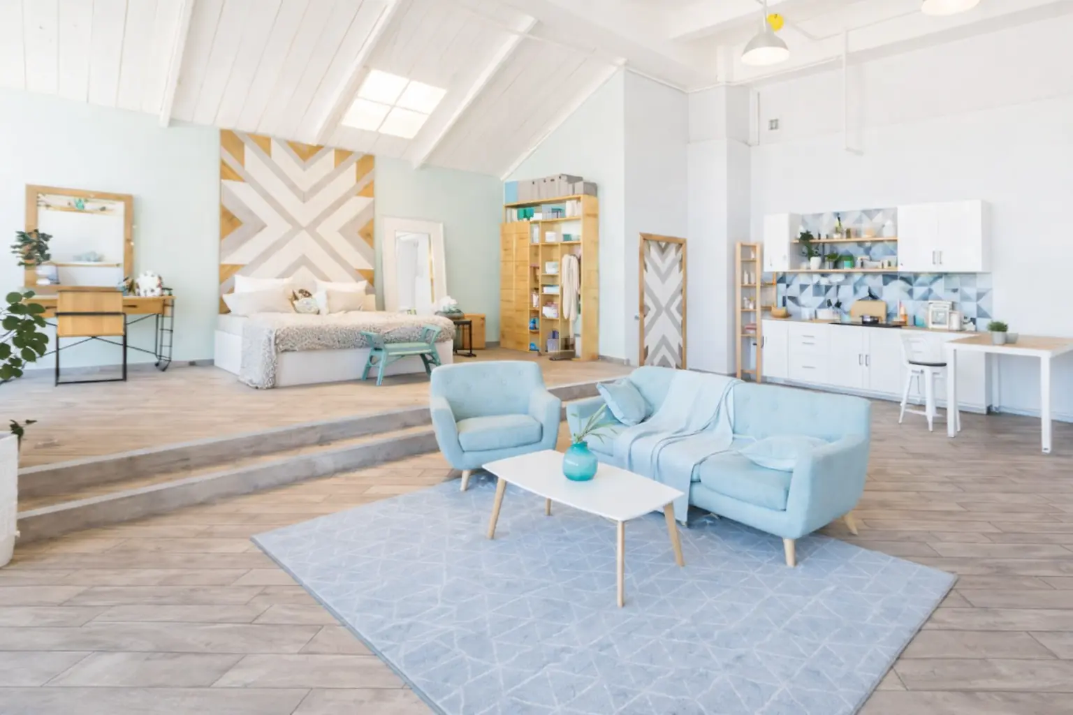
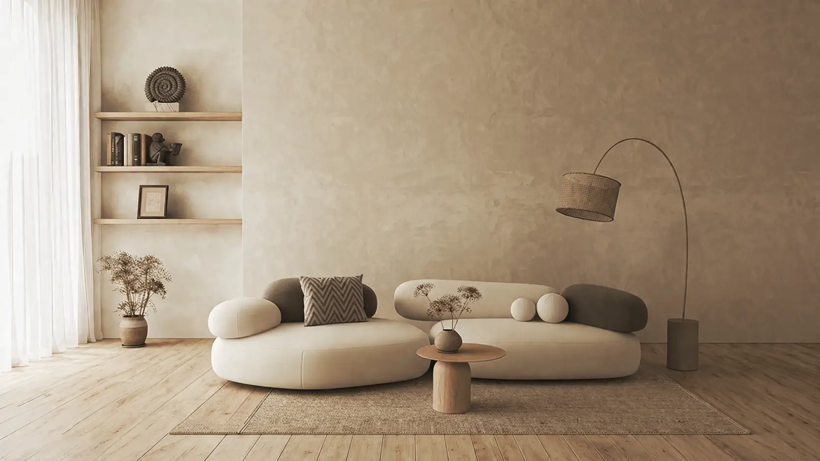
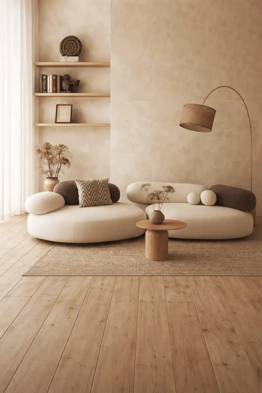
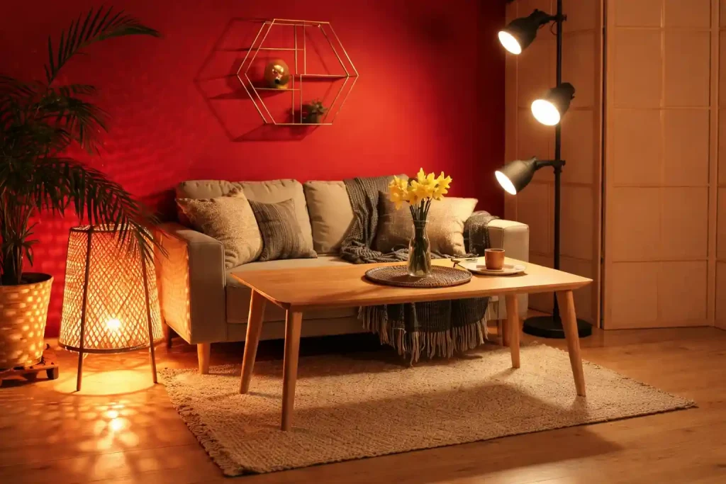
Living rooms in urban apartments rarely land in the ideal direction. To keep the space balanced, designers usually choose neutral tones that don’t exaggerate directional energy.
Popular options include:
These shades work well with the Vastu paint colour recommendations for homes and also fit contemporary interior styles.
Not every Vastu correction needs a full repaint. Many homeowners add Vastu colours for their home through small changes, such as:
These elements allow subtle adjustments without large design changes.
When directions are already imperfect, certain colours can unintentionally amplify the imbalance. Some common mistakes include:
For instance, Mumbai apartments with limited sunlight can feel cramped if deep colours dominate the walls. On the other hand, Bangalore homes with large windows sometimes require warmer shades to prevent the interiors from feeling too cold visually. A balanced Vastu colour chart helps avoid these problems.
Every home has its own challenges. A villa in Electronic City, Bangalore, behaves very differently from a sea-facing apartment in Worli, Mumbai. Because of this, colour solutions should always be customised.
At Bonito Designs, designers follow a LifeDesign philosophy that focuses on how families actually use their homes. Before planning colours, they observe everyday living patterns:
From there, colours and materials are chosen to respect both lifestyle and Vastu considerations. Bonito handles the entire journey internally:
Design → Build → Quality Check → Handover
With in-house execution and ISO-certified quality standards, homeowners receive consistent results from concept to completion. Having worked extensively across homes in Bangalore and Mumbai, Bonito designers understand how to introduce Vastu colours in a way that feels natural within modern interiors.
The goal is to create a home that feels balanced, comfortable, and thoughtfully designed for everyday living. Book your consultation today!