Eye-catching interior design requires several key components, from paints, furniture, furnishings, colour, and so on. However, while colour is often viewed from a purely visual lens, it can also play a key role in affecting your mood in a given space. This is where colour psychology comes in – the study of different hues and how they affect human emotions.
Colour psychology goes beyond just aesthetics – it takes into account how the human brain typically reacts to a specific colour, building the foundation for your home interiors’ palette. If you’re looking for the ultimate guide on colour psychology when designing the interiors of your home, you’ve come to the right place. In the art of interior design, strategically employing color can transform spaces and evoke distinct moods, showcasing the impactful role of colour in interior design.
A lot of homeowners often find themselves confused when choosing colour in interior design. While the visual appeal of each colour factors into their decision, the impact it has on their moods and emotions is often neglected.
The key to mastering colour psychology is to understand the emotional impact of each colour, along with deciding how you want each space in your home to make you feel.
As mentioned earlier, colour psychology is the theory or study of how colours affect your mood. However, the impact of colour on your psychology isn’t just limited to that – colours can affect your productivity, behaviour, creativity, and a whole lot more.
Certain hues such as blues and greens, for example, are calming and relaxing, whereas others such as reds, maroons, and oranges are energetic and passionate. However, this field of study doesn’t describe the effect of colours as being standard across the board, as different people respond differently to the same set of colours.
In the forthcoming sections, we explore the impact of each colour in interior design, what they signify, and how they can be incorporated into your full home interiors.
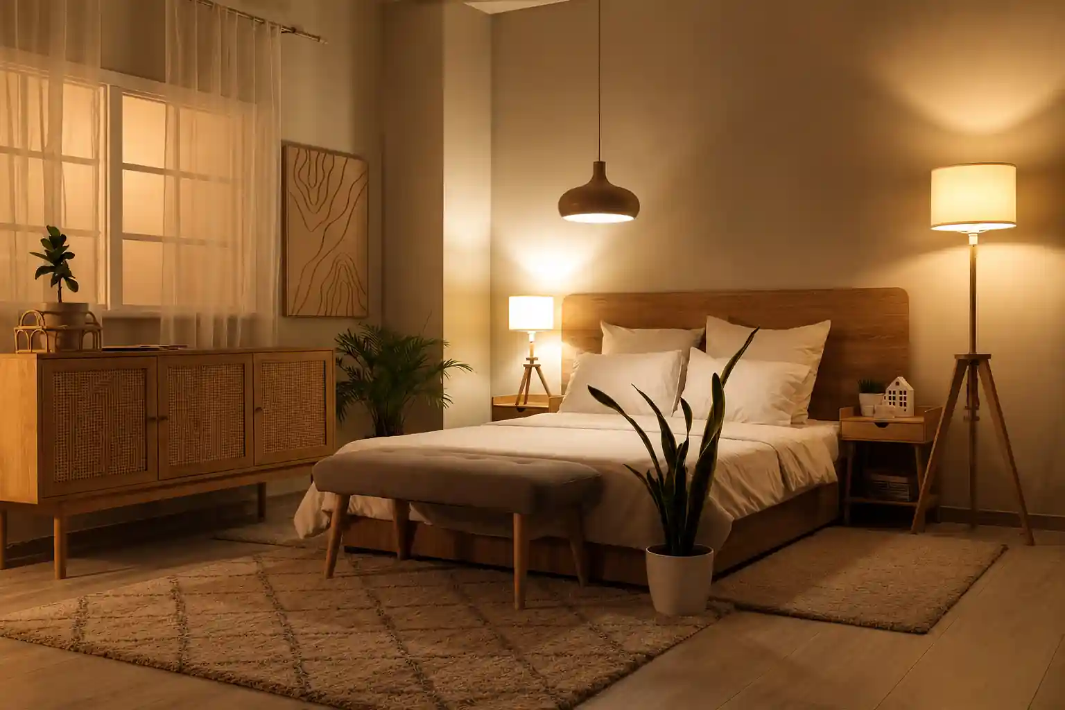
Red is one of the most vibrant colours on the colour spectrum and often represents love, passion, energy, and camaraderie. Incorporating elements of red in your interior design can create a unique focal point and add a sense of energy and vigour to your space.
When used in communal spaces like living rooms, red can inspire friendship and connection, whereas it can inspire passion and love when used in spaces like your bedroom. You can seamlessly integrate red using statement decorative pieces or even in furnishings like your cushions, bed linen, and so on.
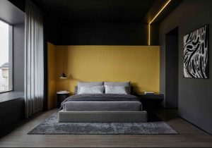
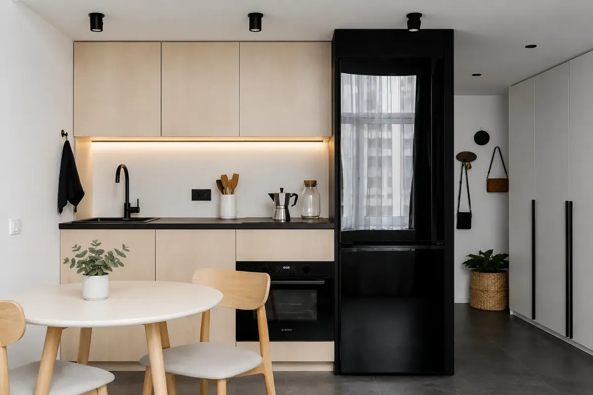
Yellow is a colour that often inspires happiness and optimism. Being a bright and vibrant colour, it can also be used to make a smaller, darker space seem larger and brighter. Being closely linked with the colour gold, it is also associated with intellect and prosperity.
When using this colour in interior design, it’s often best to incorporate it in spaces like dining rooms, hallways, kitchens, and even bathrooms. Its vibrance easily uplifts these spaces, instantly refreshing them with a stunning visual appeal.
However, when using yellow, it’s essential that you stick to pastel or brighter shades. Dull yellow can often signify sickness and decay, which are not qualities you want in your home’s interiors.
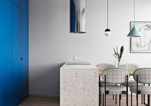
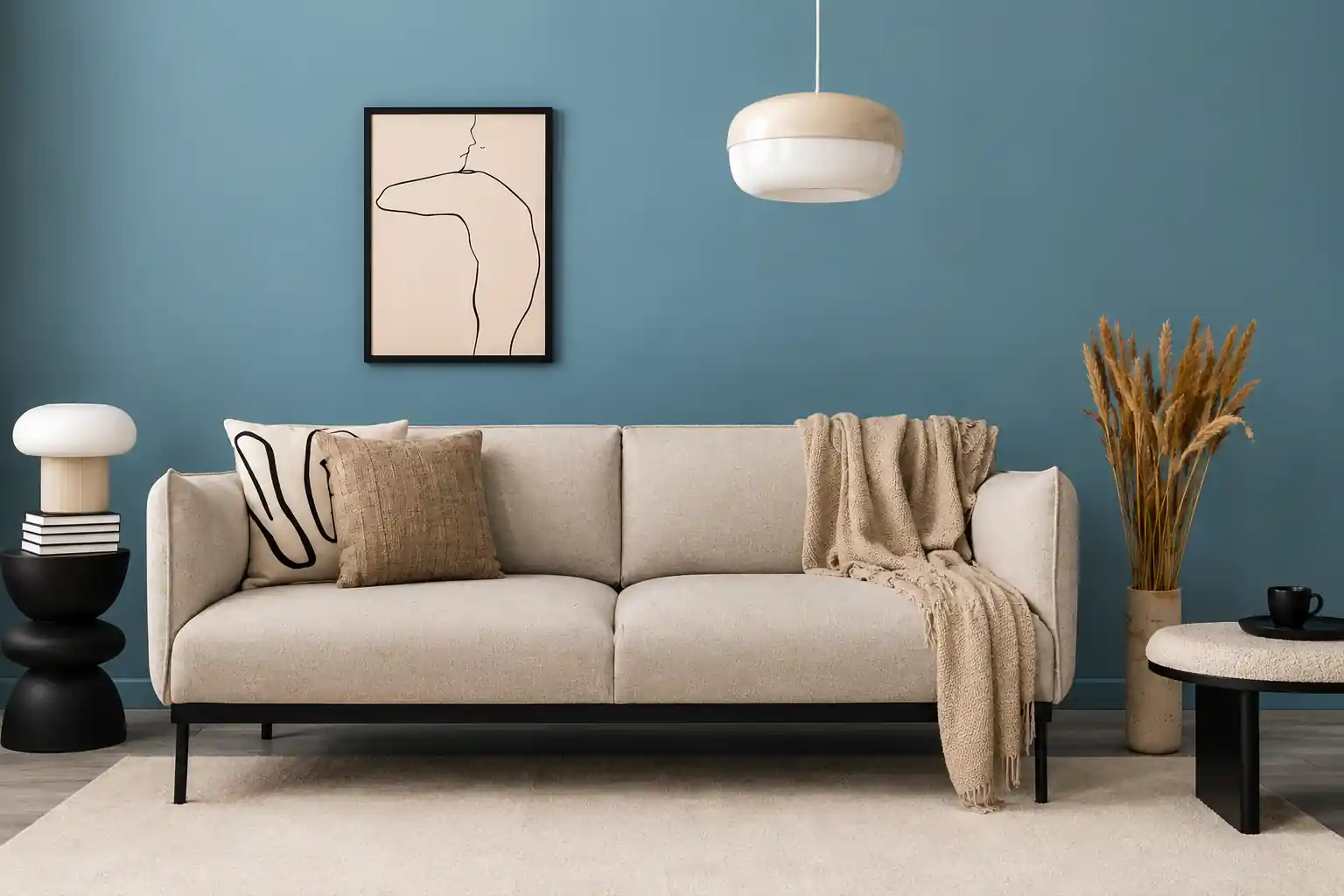
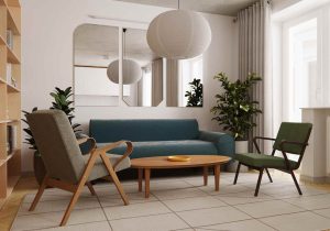
Blue is among the most calming colours you can use in your home’s interior design. In fact, it’s been known to calm the mind and reduce your heart rate, making it a prime choice for countless homeowners. Aquatic shades in particular often have a calming effect on the mind, and some examples include sky or sea blue, and light blue.
You can use blue in several hues all across your home’s interiors. For instance, you can use darker blues in accent walls in your living and dining rooms and contrast them with lighting fixtures or other details in golds and yellows. In your kids’ bedroom, for example, you can even pair a brighter blue with colours like yellow to create a playful environment.
What’s more, blue is also ideal to use across furnishings, be it your cushions, curtains, bed or table linen, and so on.
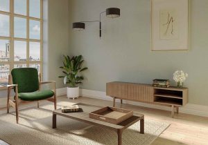
Green is a colour that’s largely associated with nature, and anyone who loves integrating some part of nature in their home’s interiors undoubtedly makes use of green. It’s a colour that relaxes the senses and helps create a sense of connection with nature, which in itself is calming for most people.
Green is also an incredibly versatile colour in interior design. When used in darker shades like olive or bottle green, it can be the perfect hue for an accent wall or a statement piece of home decor. On the other hand, lighter colours like sage and pastel green are ideal for homes with more neutral themes, making them best suited to modern, biophilic designs.
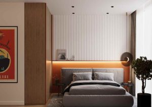
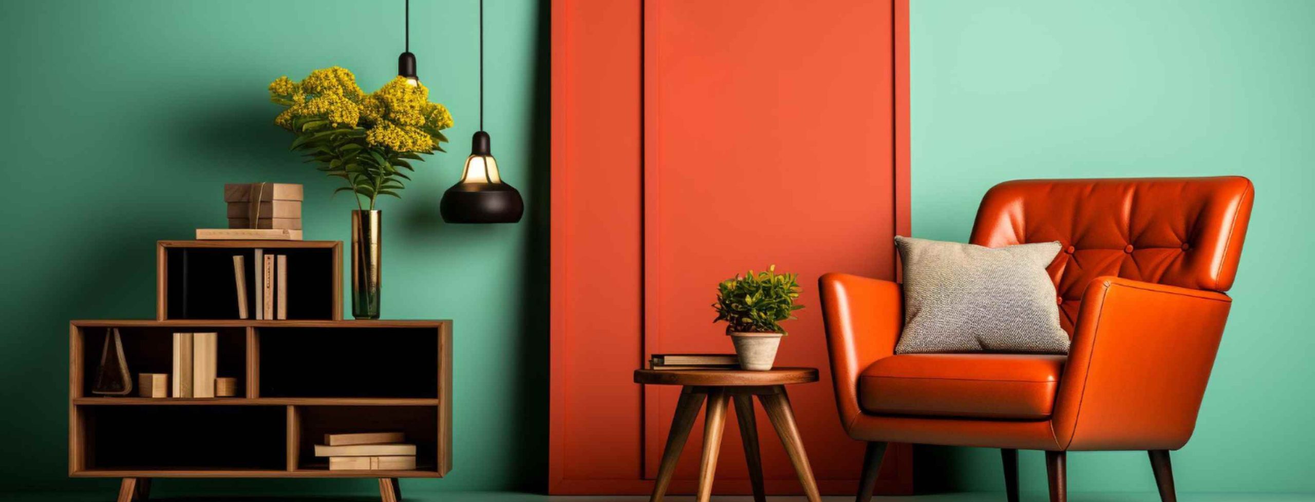
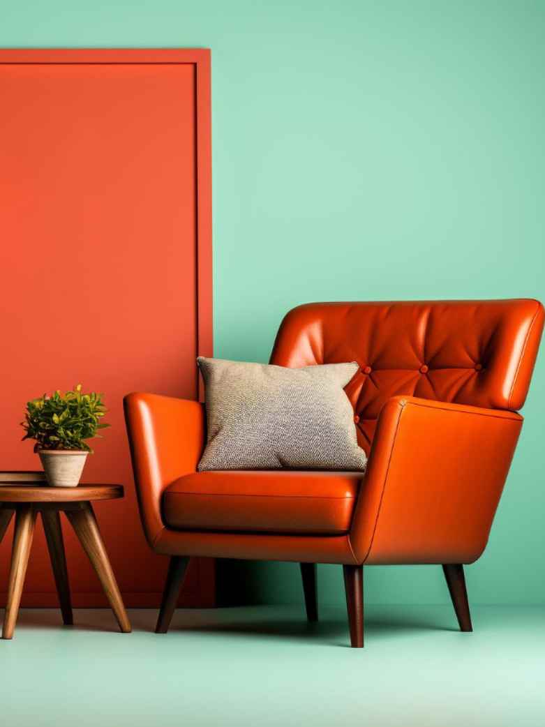
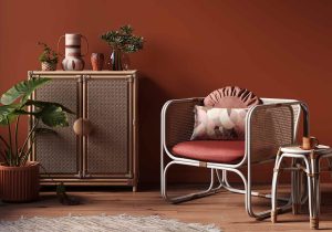
Like green, orange is another colour that symbolises nature along with sunshine. Its vibrance makes any space come to life and also adds a sense of energy to it. On the other hand, orange is also remarkably similar to red, in that it symbolises love, passion, and desire.
Spaces like bedrooms benefit most from the use of orange. However, it requires a more neutral and subtle colour to complement it and reduce the effects of the colour’s potency. Additionally, orange is also a colour that increases appetite, making it ideal for spaces like kitchens.
The color purple, typically associated with royalty, is ideal for spaces that require a lot of creativity and design. The Purple in all its different hues such as plum or violet add a unique flair and touch of opulence to your interiors.
On the other hand, its lighter hues make for a more relaxing and calming environment. These hues include lavender and mauve.
Being a hybrid of cool and warm colours, purple is one that you can easily incorporate into your interior design regardless of what your tastes are. Being a colour that inspires creativity, you can add it to your palette in spaces like your kitchen, home office or studio, and even in a walk-in-wardrobe.
In fact, it can also be the ideal choice for spaces like your living or dining room as it adds a touch of luxury to your interiors.
Adding colour in interior design requires a fine balance between visual appeal and the effect it can have on your mind and behaviour. This is just one aspect of interior design that can benefit from the expertise of a skilled interior designer.
At Bonito Designs, we have 300+ designers who understand every aspect of designing home interiors that meet all your needs and preferences. As the only ISO-certified full home interior brand in India, we’ve designed the interiors of thousands of proud homeowners.
Reach out to us for a personalised consultation and join a long list of proud Bonito customers.