Hey Guys, we are here again with a brand new 3BHK flat interiors seated on 1100 sq.ft carpet area. This beautiful space owned by Mrs. Vineeta and Mr. Krishna Chaitanya married perfectly with our interiors. Let us give you a brief about this calming space which attracts everyone to come back and enjoy the soothing interiors.
The modern, spacious home welcomes everyone with open and warm colors. This flat has an open large living room embedded with dining space making it a perfect hub for entertaining family and friends. Spacious bedrooms dominate each corner of this apartment thereby giving enough privacy to get away from everyone and have their own time.
The moment you enter your first step into the house, you can see a beautiful balcony straight in front of your eyes and a nice rustic sofa placed on your right side staring at you backed with well designed see-through partition.
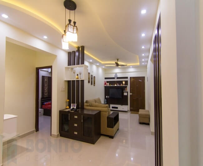
Moving inwards you can find a modular TV unit wearing its presence in dark brown and white laminates. We mounted the wall panel in about 3 and half feet height with a couple of ledges on the top and floating cabinets at bottom to serve their storage needs. We created a dramatic effect by providing spotlights in the ledge so that the artefacts placed over here can be highlighted.
Floating cabinets were designed with white laminates just as a contrast for the wall panel color and it accommodates their storage needs of CD and DVD’s. If you can closely observe the middle cabinet, it is closed with glass which acts as a good medium to grasp the remote signals very easily.
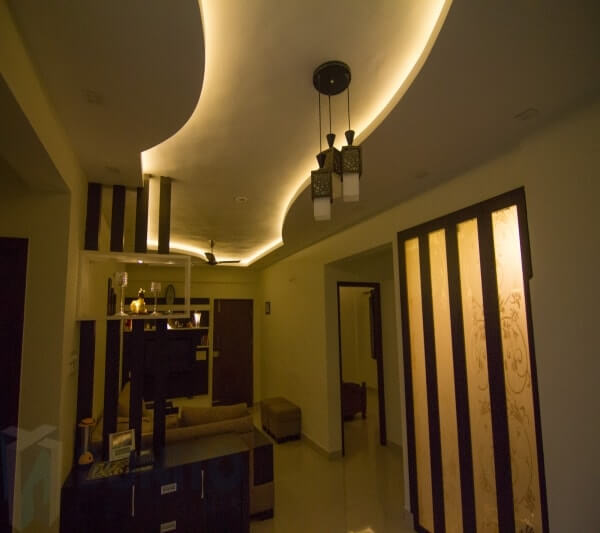
Since this living room has dining room in it, we cleverly planned a see-through partition in form of wooden pillars at a regular intervals and with a simple niche placed at a certain height. Also, you will find a well-planned crockery unit as a conclusion of the partition behind the sofa head-rest.
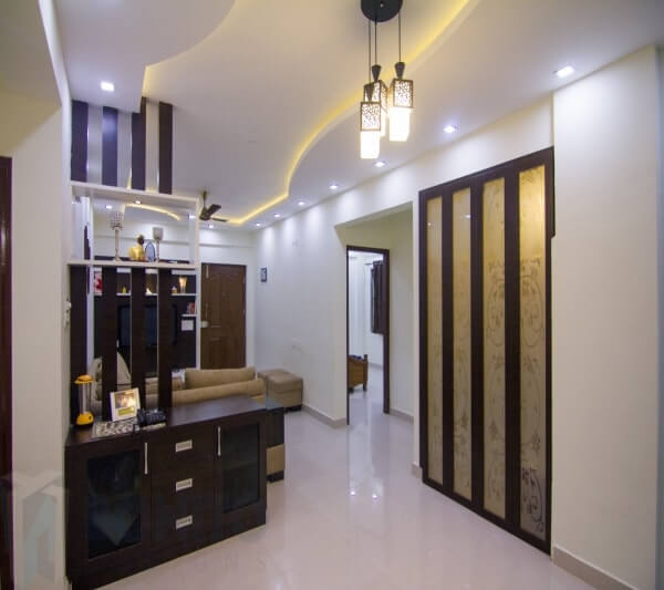
Crockery unit is simple and designed with 3 sectioned furniture. Open-able cabinets are enclosed with tinted glass doors on either side and 3 drawers fixed in the middle.
Traditionally designed tall Pooja unit is positioned at a walk-able distance from the crockery. The door of pooja room is a highlight apart from its inner beauty. The door was designed with folding mechanism which gives a sleek look without accumulating much space.
False ceiling design in living room gives you a picture of flowing curve highlighted with cove-lighting and the spot lights in it.
As the kitchen occupied less space in this particular carpet area, putting the kitchen being closed doors may not be the most contemporary choice for us. We need the kitchen to be as much functional as it can; without highlighting the space constraint. So we have designed sleek ledges under the top modular kitchen cabinets on either side of the chimney to place their spice tins.
On either side of the chimney in this modular kitchen, as usual to give a symmetric feel, we designed couple of top cabinets enclosed with frosted glass. And the bottom cabinets survived the purpose of bottle pull-out, 3 drawers for placing their regular cutlery, and a sink cabinet.
We designed a breakfast counter cum cutting spot to chop their vegetables right opposite to the hob point in this small kitchen design. And on the right hand side, we have provided a tall unit with sliding shutter instead of open-able door since space is a constraint again.
We always believe that “A good night’s sleep is one of the reasons to be happy, healthy and productive“.
All the 3 bedrooms in this floor plan were spread out for maximum privacy, with buffered space. So let’s see how we designed these bedrooms then!
Master bedroom is designed in neutral tones with lots of closet space in the form of end – to – end 3 slider wardrobe. We used the same laminate which we used in living room interiors to ensure the same theme flew around. To devoid the boring look, we placed a mirror strip and lined it horizontally on the wardrobe.
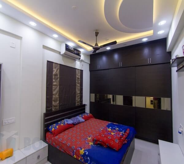
Nicely carved cot headboard will arrest your eyes in its simple looks. It was all because of the SS strips we used. A dresser unit teamed with chest of cabinets continued the same concept of bottom cabinets we have provided for TV unit in this room. Above this we fixed a framed mirror on the wall sided with 3 feet tall sleek cabinet to place their cosmetics.
What else you can dream for a kid’s bedroom rather than a functional wardrobe, funky false ceiling and an organized study unit?
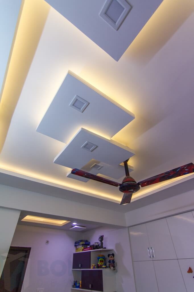
In this particular room as the room plan is enclosed with a huge hollow space, so we designed a wardrobe to fill the space so that it looks clean, sleek and flat.
This 4 door openable wardrobe is stunning in its looks because of the contrast color laminate square pieces arranged in a puzzled way.
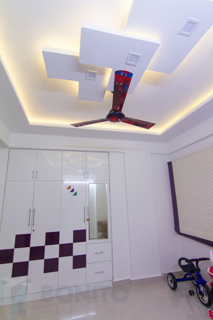
A normal height study table with white laminate is all what kids love to draw their favorite scribbles on the table instead on the books.
So just to let their creative juices flow we proposed a white glossy laminate for the study table and same purple color laminate we used in wardrobe for wall mountable units. False ceiling again was designed in a funky way with the dropped down pieces of L shapes.
Guest bedroom again has a huge hollow space just like the kids bedroom has, we designed a sleek wardrobe with matte finish laminate. Here we used 2 contrast color laminates for the entire openable wardrobe.
False ceiling was designed to minimal with running cove lighting and spot lights at regular intervals.
Watch the video online at ->
And subscribe to our blog to get more design tips. To get stunning interiors from us do contact us
Session expired
Please log in again. The login page will open in a new tab. After logging in you can close it and return to this page.
Session expired
Please log in again. The login page will open in a new tab. After logging in you can close it and return to this page.