Mr. Jai and his wife Mrs. Binita are frequent travellers. They keep on collecting artistic things across the globe. The couple have a modern taste and they wanted the same to imbibe and reflect in every corner of their interiors.
They wanted their walls to be simple and plain so that they themselves can change the look of their walls with their art collectives. Their requirements are very simple and stylish.
It was an opportunity for us to do interior designing in Bangalore which was located at Prestige Shantinikethan. Let us see how we designed as per their requirements.
Coming to the foyer area, we have an aptly sized foyer space where anyone can sit-out for a while. The walls at the foyer area are painted with minimalistic design.
The tone of lighting adds warmth to this place and a welcoming gesture for the visitors. And the wall in the foyer area is designed to threshold so that the couple can hung a nice picture/ wall painted mounted on it.
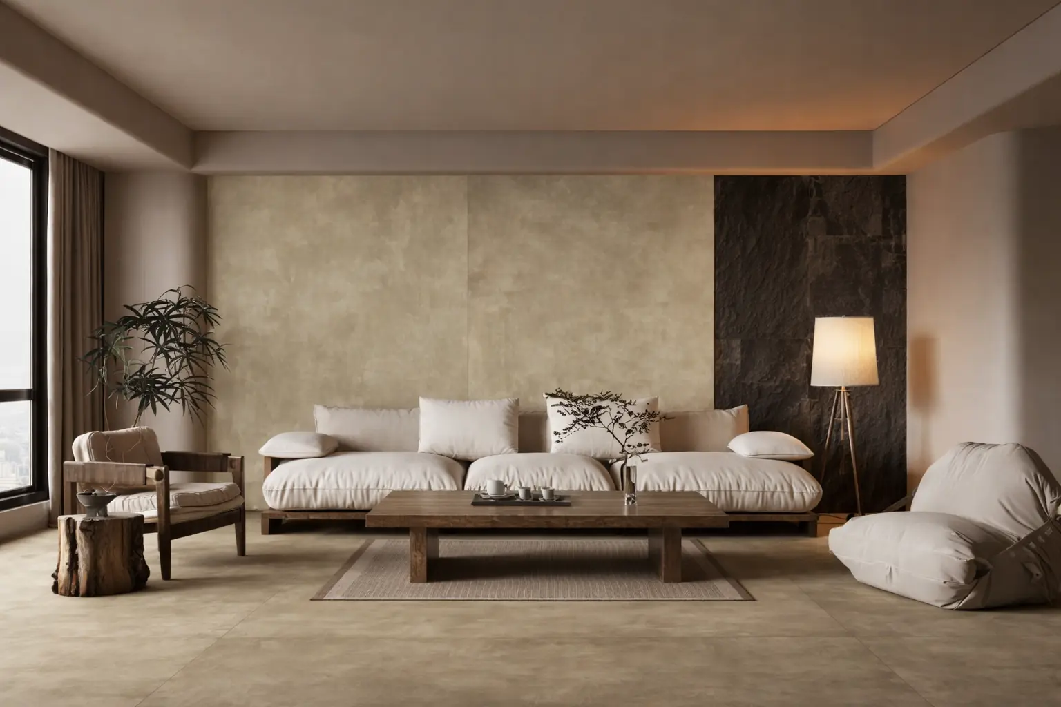
The foyer gives way to a huge living and dining space that has an amazing 7 footed sliding window which pumps in sufficient light till evening. The living room is a huge open 20×20 area space, where anyone will get tempted to fill in the space with lot of accessible items all around.
This is the major black spot that will ruin the entire look of the open place and natural light which are main ingredients that make your house a home.
Keeping this mind, we designed 2000 Sqft of the living area in a simple approach with false ceiling covering the entire living room. The color combinations and the designs are uniquely chosen as per the customer’s simple taste.
The weightage of the lights was spread throughout the space where they can have the light evenly lit as well as some main focus on the dining and in the living area.
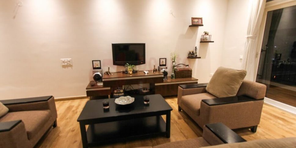
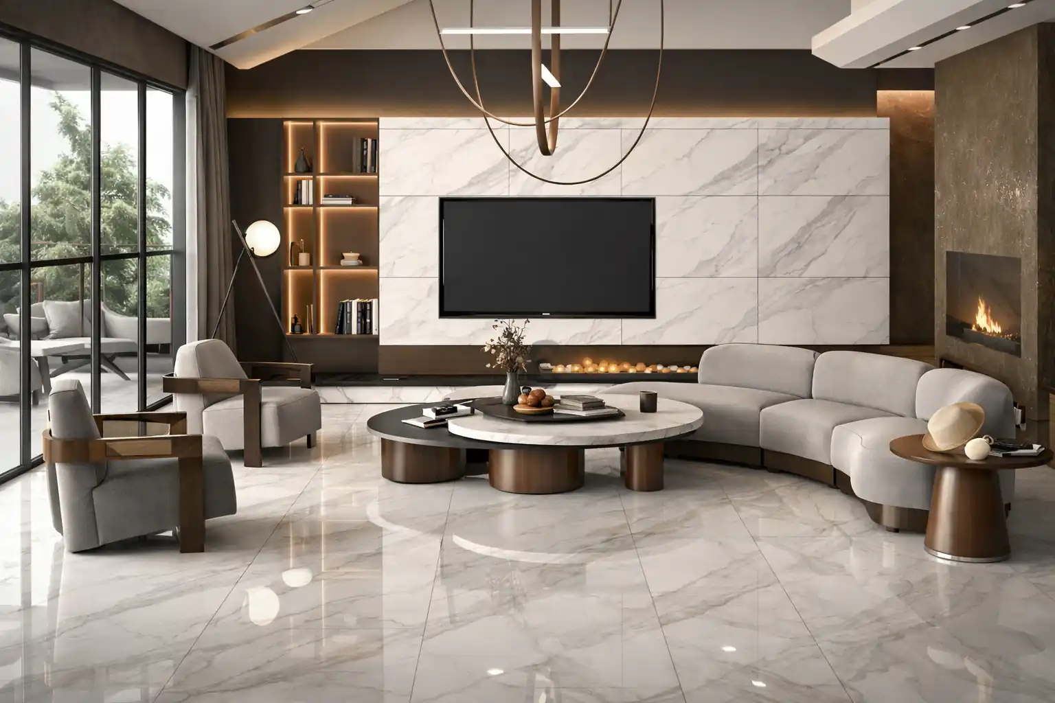
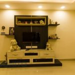
The entertainment spot in the living area is the TV unit, which is surrounded with low height TV cabinet summoned with huge pullout to hide pile of newspapers and magazines which would otherwise clutter up your tea table and sofa.
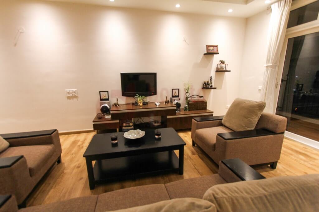
We made the sofa to be placed at a certain watchable distance from the TV thereby we made it to act like a virtual partition both for the living room and the dining area. We avoided to place a wooden or mirror partition which ultimately spoils the overall open-ness of the living area.
We wanted to give an easy access to the balcony so we gave a walkable distance from sofa zone to 7 footed sliding window, by not placing the sofa stick to the 7 footed sliding window where one can enjoy the natural light that pumps from the light colored curtains till evening.
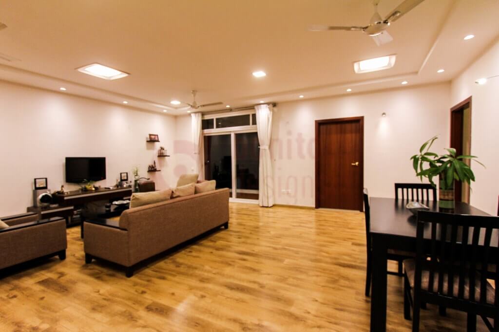
The dining space is faced to the kitchen and can be easily approached by all the bedrooms. Since the walls are at least of 20 feet width we gave it a plain look by not choosing the stone cladding or wall decorators which might look good but ultimately took away the focus of the object’s beauty when we hung up on the wall.
This is what exactly we wanted since our customers are a way too paintings savy as they want the look of the walls to be readied constantly whenever they acquire a new painting.
With an area of 13 x 11 huge U shaped kitchen space, most of the women’s mind will be pre-occupied with lot of options with regards to usage of the free space. They want to place their utilities throughout the entire rectangular top which in turn spoils the simple and continuous look.
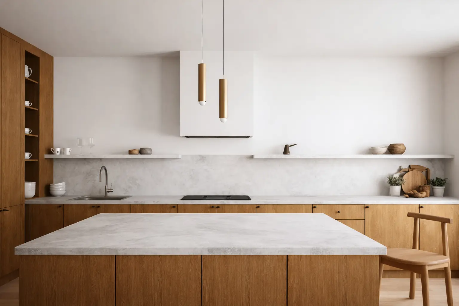
As Mrs. Binita is very particular about simple designs and elegant look we designed her place(kitchen) with a decent approach. We gone with a single texture and laminate to gave it a unique look.
We started off the design by keeping the hob and chimney exactly in the center and adding in perfect symmetry with the top cabinets. The chimney pipe got concealed behind the loft that spans the entire length of top cabinets.
Since the kitchen can be easy viewed from the living room, we chose to push the oven and other huge utilities over to the left (beside the fridge point) as that is the side that is least visible.
In the bottom and both (right and left) sides of the hob, we designed the spacious tandem boxes where 70% of the cookery equipment can be easily accessible.
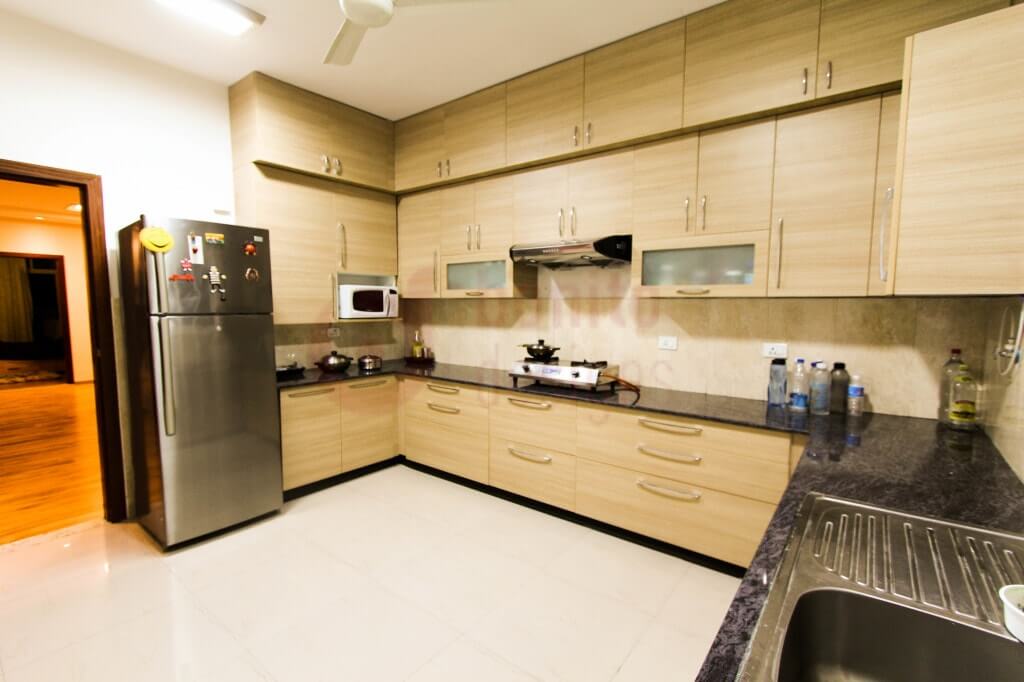
Access to the utilities is just one step ahead.
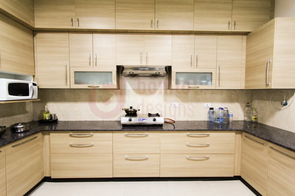
On the left of the top kitchen cabinets we planned the cabinets to cover all the electronic gadgets like blenders and all other electronic gadgets which need not to be seen when you enter right away into the kitchen.
Tip:
To give your kitchen a spacious look it’s better to hide those electronic gadgets in the wardrobes as soon as your work gets done.
On the right corner of the kitchen we mounted the water purifier on the wall and covered it with the bottomless cabinet. This eliminated the blue patchy look on kitchen walls.
The ultimate look of your kitchen can only be elevated when you hide the heavy gadgets.
Also, we make used of the corner zones of the cabinet there by embossing with D trays and magic corners. (Even if you can’t afford the magic corner, you can just leave that space covered with the door. Whenever you have the strength to afford one you can fix with without any hassle thereby not regretting choice of leaving empty space.)
Most of the flats lack study room, but this is not the case with Mr. Jai as the couple work from home most of the times, they are very particular about having a peaceful ambiance in study rooms without getting disturbed with the home noises.
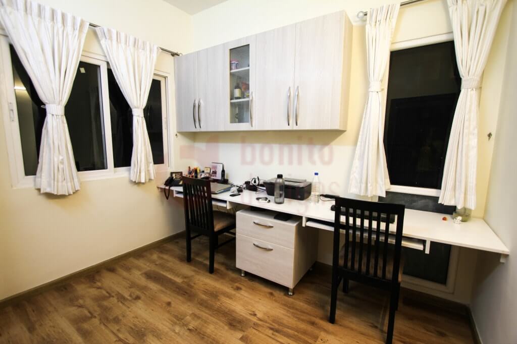
With a single lengthy straight table top we sectioned the entire length into two halves just by using a simple cabinet. This cabinet acts both as a storage space as well as the sectioned part between two.
And over the top we gave a simple storage cabinet to get easy access of the files without any heavy moments, lined with dual sliding window. Also, to the one end of the room we provided a huge size cabinet so that they can place large storage files.
Since Mr.Jai being taller than 6 feet high he wanted his wardrobe to be personalized for him. With that in mind we make sure that his wardrobe is more than the average height (7 feet) as well as the mirrors are fixed to it with a certain height where he could easily access the mirror.
The rest of the décor was kept quite simple with just a designer light on the wall.
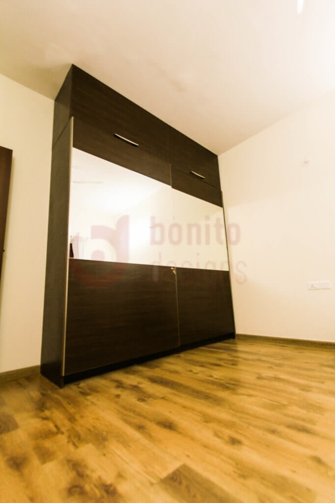
The main attraction of this bedroom is the huge 7 feet sliding wardrobe clothed with a simple and futuristic pattern on the sliding doors which otherwise would have looked plain and boring if it were left as it is.
The dressing unit in this room is placed adjacent to a 7 feet sliding window which has let in a lot of natural light into the room. That is the reason why we have placed the dressing positioned here, so that you can see your beauty under lot of natural light.
On the other end we designed a friendly 8 feet sliding wardrobe that was lined with a straight and simple pattern from one to the other end.
We gave the entire house a unique look by keeping the colour palette constant in every room.
You can check out the entire project in video form on our Youtube channel
[prettyyoutube video=”https://www.youtube.com/watch?v=bvfqdptrm64″ pic=”” caption=””]

Session expired
Please log in again. The login page will open in a new tab. After logging in you can close it and return to this page.
Session expired
Please log in again. The login page will open in a new tab. After logging in you can close it and return to this page.