Interior colour combinations shape not just how a home looks, but how it feels in everyday life. Warm tones create energy and intimacy, while cool tones bring calm and make spaces feel larger. The right choice depends on room size, lighting, and usage rather than fixed rules. A balanced mix of warm and cool elements helps create a functional, comfortable, and visually appealing home.
Walk into any home, and you feel the colours before you even notice the furniture. Some spaces feel instantly cosy. Others feel airy, calm, or almost quiet. This feeling usually comes down to one decision that most homeowners overthink and still get stuck on: the interior colour combination.
You’re not just picking shades, you’re deciding how your home will feel on a rushed Monday morning, during a lazy Sunday nap, or when guests show up unannounced. So, let’s go through the basics of interior colour combinations to help you find the best vibe for your home.
You’ve probably heard these terms a hundred times. But when it comes to applying interior colour combinations at home, things get fuzzy. Here’s the simple breakdown:
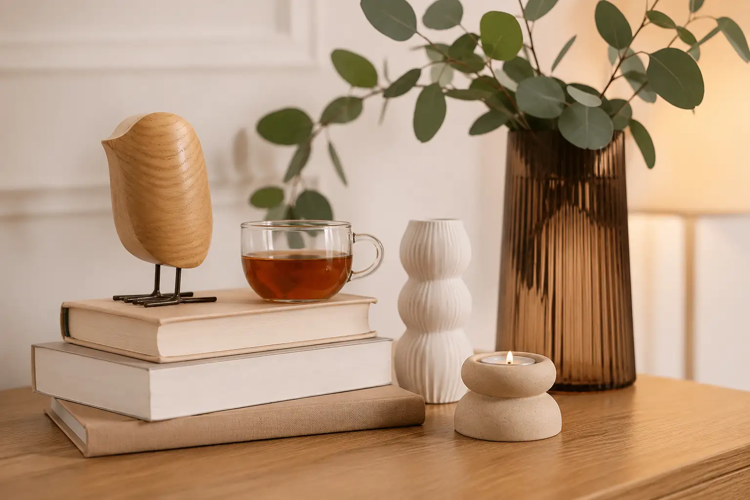
Think reds, oranges, yellows; shades that remind you of sunlight, warmth, energy. They tend to move visually closer, which means they can make a space feel more intimate.
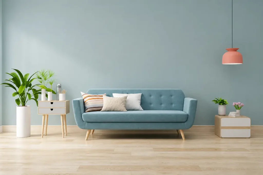
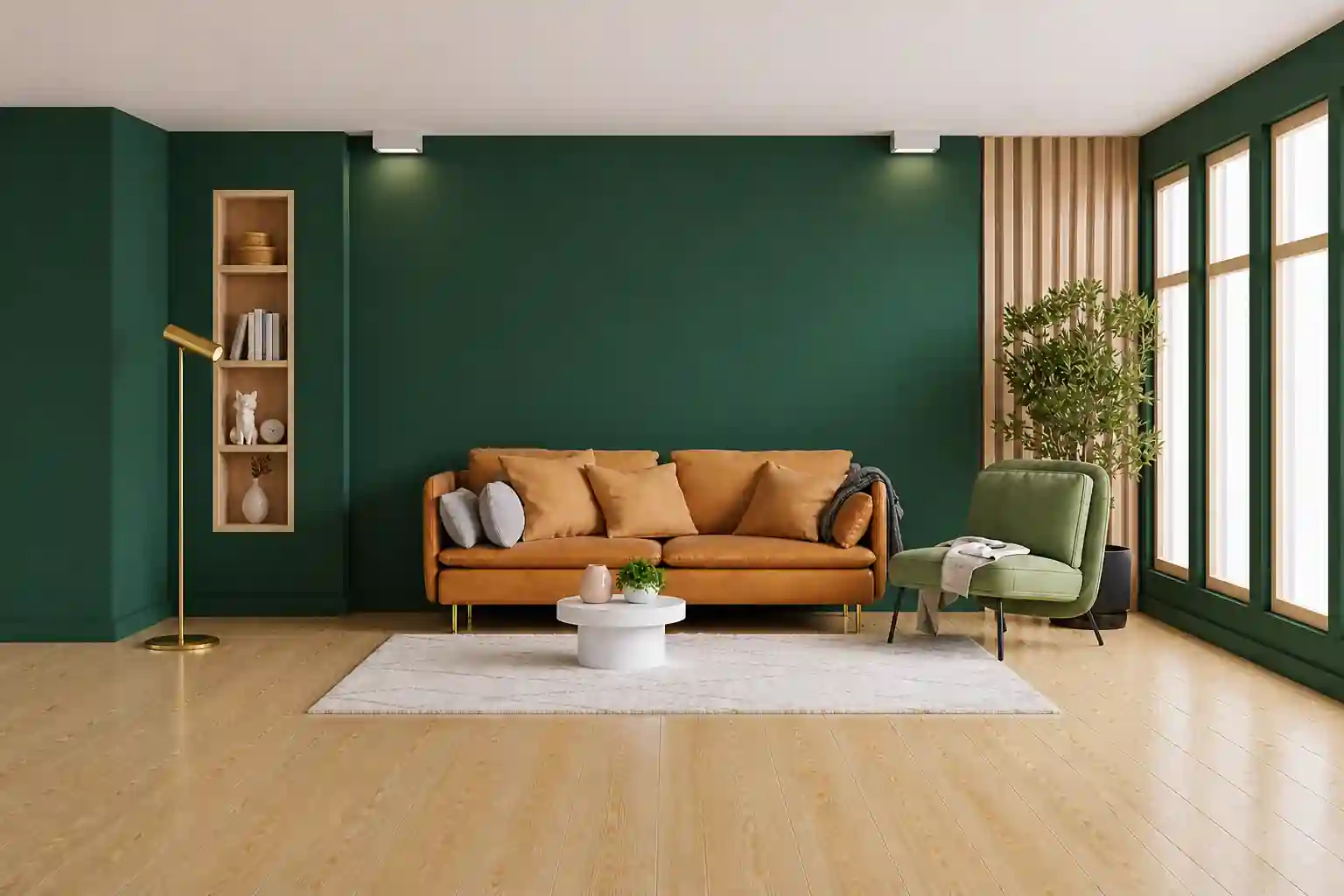
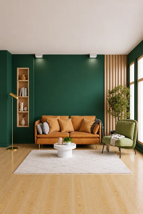
Blues, greens, and greys; these are calmer, quieter tones. They recede visually, which is why they often make rooms feel bigger and more open.
Sounds straightforward. But once you start building a home interior colour combination, these colours need to work with your home’s overall aesthetic and your personal tastes.
In most Indian homes, space isn’t unlimited. You’re dealing with apartments, compact bedrooms, multi-use living areas, maybe even a work desk squeezed into a corner. Colour plays a bigger role here than people realise.
That’s why choosing the right interior colour combination isn’t just aesthetic, it’s functional.
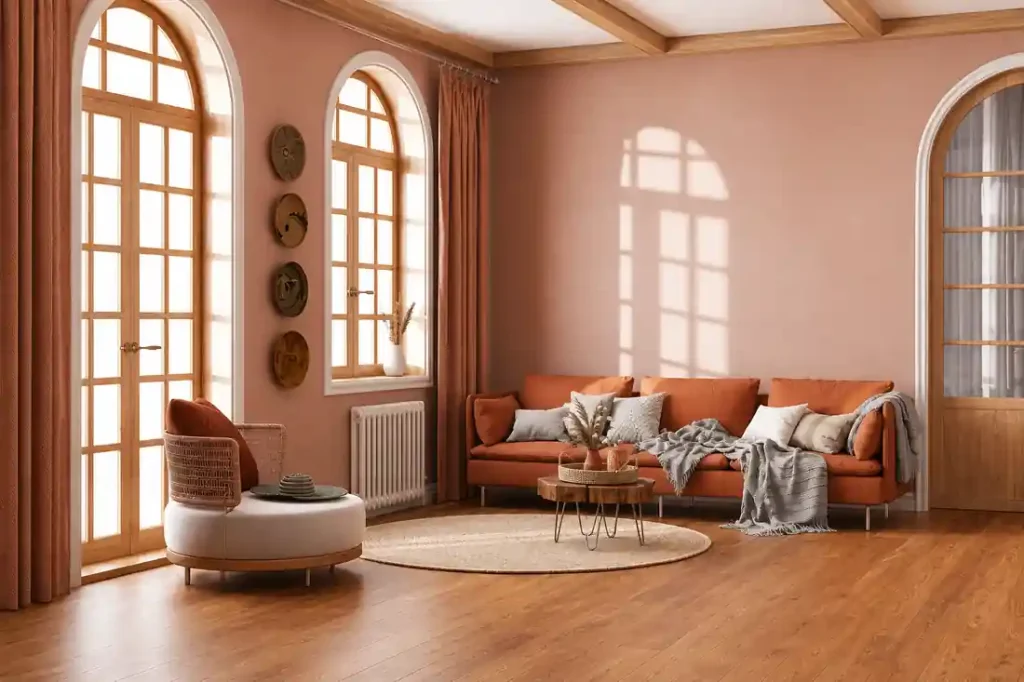
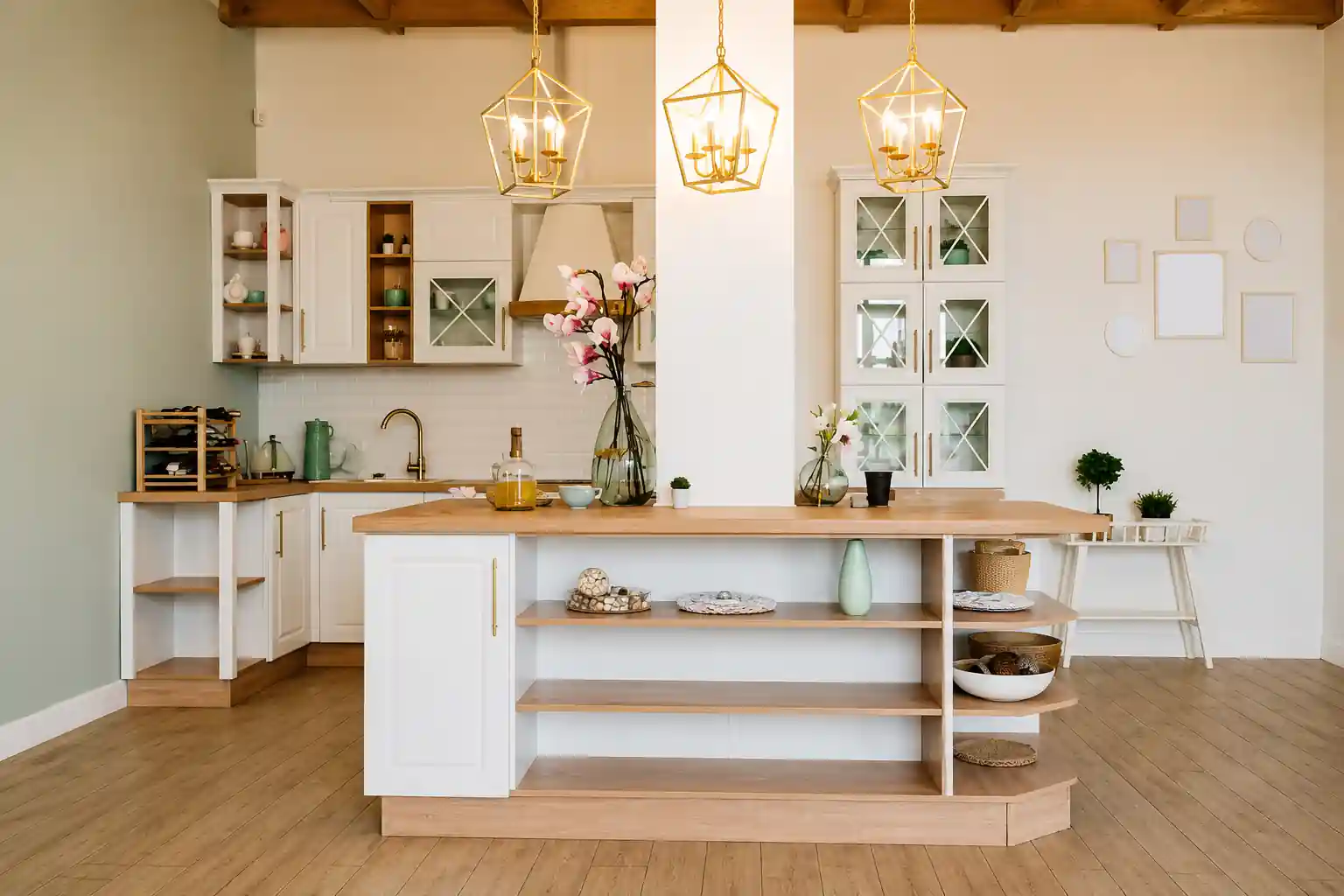
Warm tones bring life into a space. They’re great for areas where people gather, talk, eat, and celebrate. Think warm and welcoming living rooms where guests pile in during festivals, or dining areas where conversations stretch longer than meals. Use warm interior colour combinations for:
Warm palettes create a sense of closeness. That slightly snug feeling that makes a space feel “lived in.” However, too much warmth can feel heavy, especially in smaller rooms. A deep orange or red wall in a compact bedroom can make the space feel overwhelming over time.
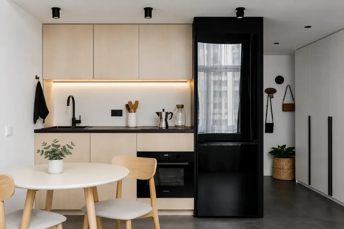
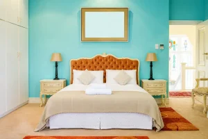
Cool tones make spaces feel clean, calm, and visually larger. Perfect for modern apartments where every inch matters. Bedrooms, especially, benefit from cooler interior colour combinations. After a long day, you want a space that slows things down. Blues and soft greens do that naturally. They also work well in:
But again, there’s a flip side. Overuse cool tones, and the space can start feeling flat. The space can start to feel impersonal, like a hotel room you don’t quite connect with.
Let’s bring this into everyday life. Morning rush, you’re getting ready, hunting for keys, checking your phone. A warm-toned space can actually feel energising here. Late evening, lights dimmed, you’re winding down. That’s where cooler tones help your mind slow down.
Kids studying at a desk in the bedroom. A soft, cool palette keeps distractions to a minimum. But add a small warm accent, maybe in shelving or décor, and the space doesn’t feel dull.
Even clutter plays differently with colour. Warm shades can make a room feel fuller faster. Cool shades tend to hide visual noise better, which is useful in homes where storage is tight and things don’t always stay perfectly organised.
This is why there’s no one-size answer to a home interior colour combination.
Start with how the room is used and ask yourself simple questions:
Choose your interior colour combination based on your answers to the above questions. A small bedroom with limited light? Lean towards cool tones, but add warmth through textures. Cushions, wood finishes, soft lighting.
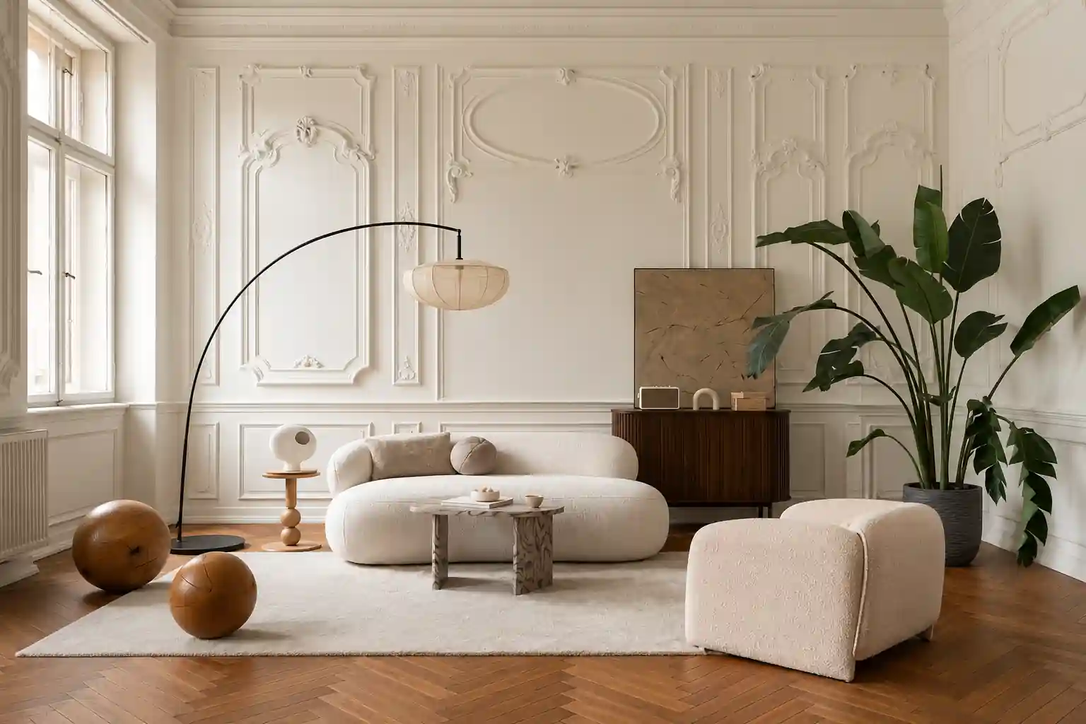
A large living room that feels empty? Warm it up. But balance it with neutrals so it doesn’t get too intense. It’s less about choosing sides and more about balance.
The best spaces rarely stick to just warm or cool; they mix the two. A neutral base, a dominant tone, and then accents from the opposite palette to keep things interesting. For example:
At Bonito Designs, colour isn’t treated like a last-minute decision. It’s part of a larger system. Their LifeDesign approach focuses on how you actually live in your home. Morning routines, work setups, storage habits, and even where things tend to pile up, all of this feeds into the design.
They plan interior colour combinations based on how they would interact with lighting, materials, and your home’s layout. And since everything is handled in-house, from design to build to quality checks and final handover, there’s consistency. What you see in the design stage is what shows up in your home.
Warm or cool isn’t the real question. The real question is how you want your home to feel when you’re actually living in it. Book a consultation with Bonito Designs to find the interior colour combination that truly fits your house and your lifestyle.