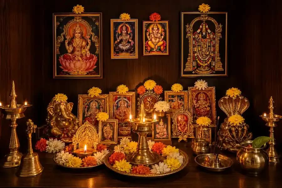
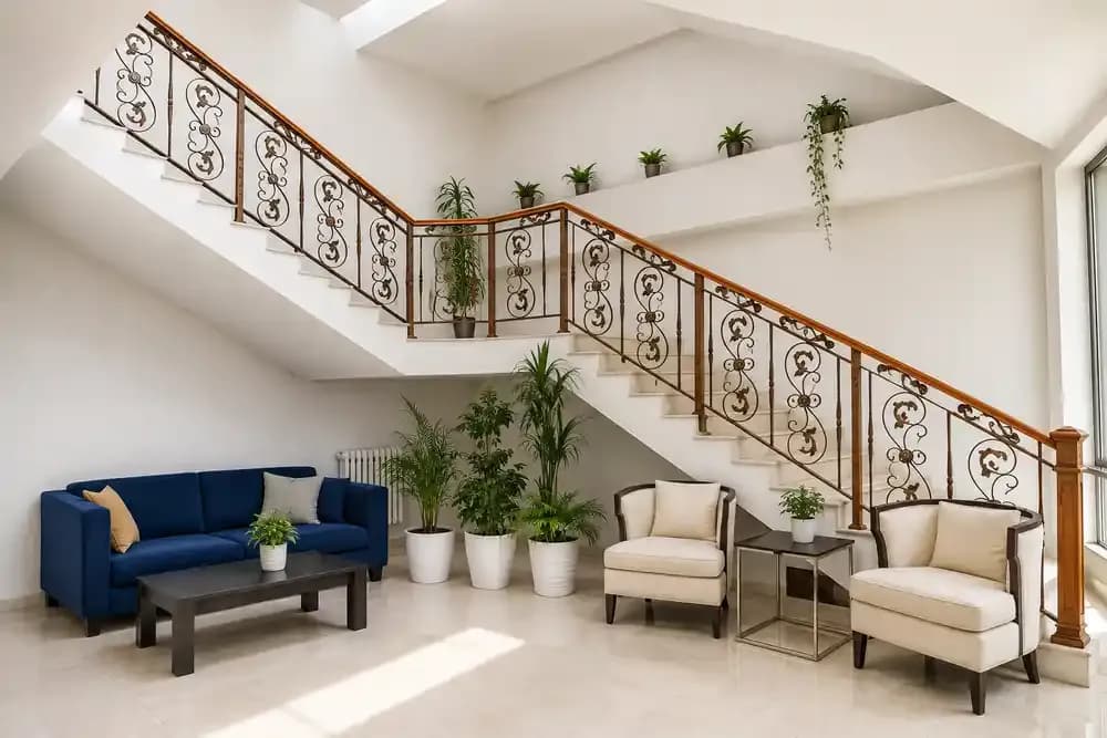
Vastu colours for homes can influence how calm, balanced, energetic, or grounded a room feels. Shades such as warm white, yellow, green, blue, and earthy neutrals are commonly recommended because they support different room functions and directions. The best results come from balancing two or three base colours and adding accents through furnishings and décor.
Most people underestimate the importance of colour in home interior design. Colour can play a major role in how a room feels, sometimes even more potently than the furniture and layout.
The right Vastu colours for homes are based on the idea that each colour carries a specific energy that either supports or disrupts the function of the room where it is used. The good news is that these colours are not exotic or difficult to work with. Most of them are already in common use in Indian homes, just not always applied with enough intention.
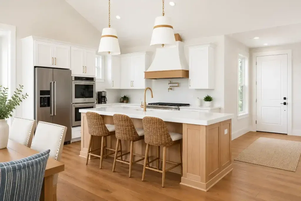
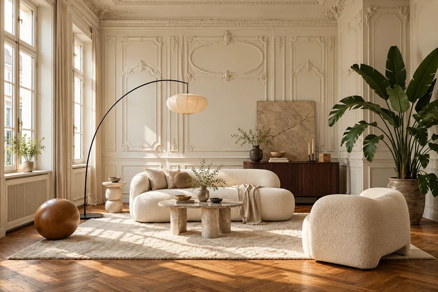
White is the most versatile Vastu colour for home interiors. It is associated with cleanliness and mental calm. In Vastu, it connects to the west and north-west directions and is considered particularly suitable for rooms that need to feel open and uncluttered.
In compact Mumbai apartments, where rooms are smaller, interior designers tend to recommend white, off-white, ivory, and soft cream can make a real difference. They reflect light, make walls recede, and give the room a restful quality that stronger colours cannot always achieve.
Yellow is one of the most consistently recommended Vastu colours for home interiors because of its association with warmth and optimism. In Vastu, it connects to the north-east and is considered particularly favourable for kitchens, study spaces, and dining areas where energy and engagement are needed.
Colour guidelines for homes according to Vastu suggest avoiding high-intensity yellows on entire walls, as they can become visually tiring. Warmer variations of yellow can rejuvenate the room without feeling overwhelming.
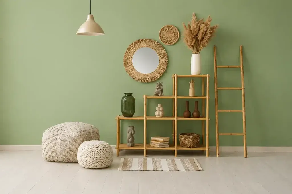
Green sits at the intersection of Vastu and practical design. It is associated with growth, balance, and renewal, and in Vastu it connects to the north direction, which governs prosperity and new opportunities.
As a positive colour for home interiors, green has grown in popularity, especially in modern urban homes. Sage, moss, forest, and muted olive all perform consistently across different room types and light conditions. In bedrooms, softer greens with grey undertones are among the most reliable choices for rest.
If you are wondering which colour is the best for home interiors that need rest and emotional calm, blue is the answer across both Vastu and colour psychology. It is associated with the water element, the north-east direction, and a quality of stillness that makes it particularly well suited to bedrooms and prayer rooms.
Blue is a colour that works best when it is not vivid or saturated. Dusty blue, soft slate, pale indigo, and muted teal all deliver directional energy without visual weight. In rooms with limited natural light, blue should always be tested against the actual light conditions before committing, as it can feel cold in north-facing rooms.
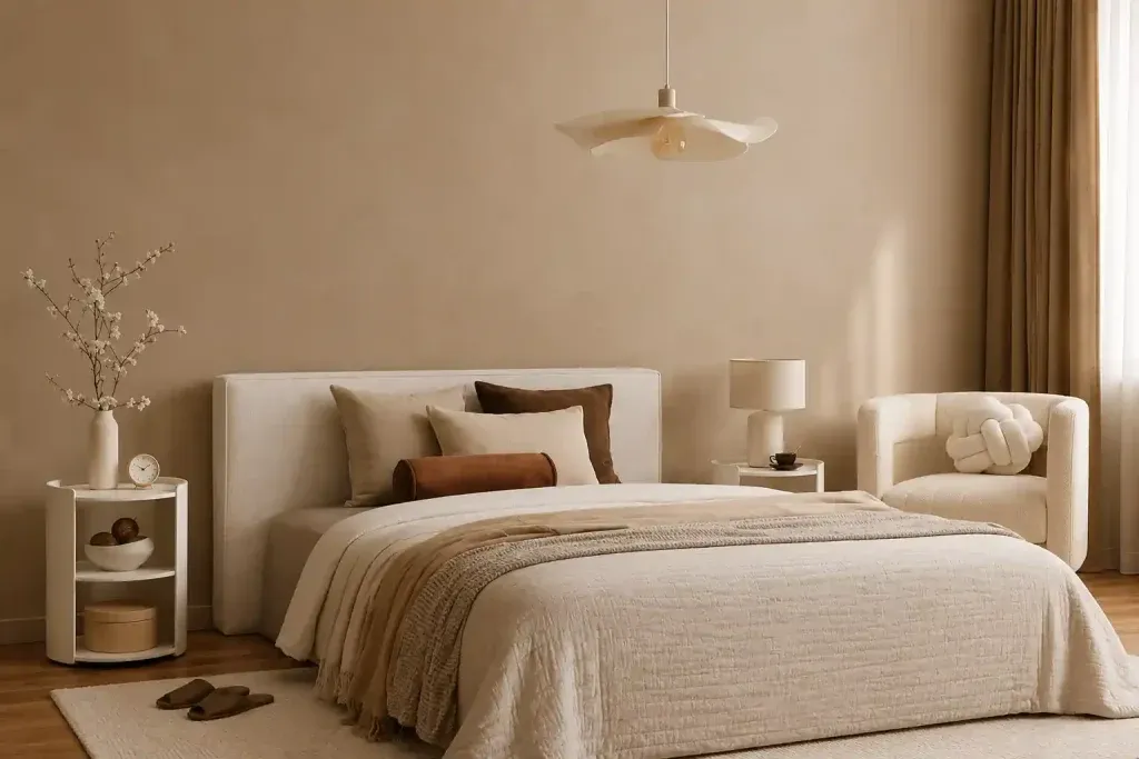
When researching which colour is best for your home according to Vastu, earthy neutrals, warm beige, terracotta, sand, and raw umber are the go-to options for most Vastu experts. These tones connect to the earth element, the south-west direction, and the quality of stability.
Earthy neutrals work as the connective tissue because they complement almost every other colour in the home, making them the most practical house colour idea for homeowners who want a cohesive theme across multiple rooms.
Pleasant colours for a home are not just about individual shades. The best tip for home Vastu is to blend shades that complement each other and align with each room's unique requirements. Vastu colour for homes works in practice when two or three tones are chosen as the foundation. You can then introduce accent colours through textiles, artwork, and furnishings.
A 2024 Indian study on colour psychology found that colour preferences are closely linked with emotional responses and mood perception, which aligns closely with what Vastu has always maintained: that the colours surrounding you in a home are extremely important.
Choosing colours according to Vastu is the first step, but applying them effectively is also essential. This is where Bonito Designs comes into the picture. Bonito Designs approaches colour as part of the full design brief and not as a separate entity.
Vastu colour selection for homes is always tied to how the space is used, which means Bonito Designs' approach works both energetically and practically. Every colour decision is tested against the real conditions of your home before anything goes on the walls.
If you want your home's colour palette planned with meticulous care, book a consultation with Bonito Designs today.
Both modern classic interior design and transitional design combine classical references with contemporary furniture, storage and lighting. However, modern classic rooms retain more symmetry and formality than transitional spaces. This article covers how transitional interior design differs across furniture, mouldings, colours, materials, lighting and maintenance, along with practical guidance for choosing between the two styles.
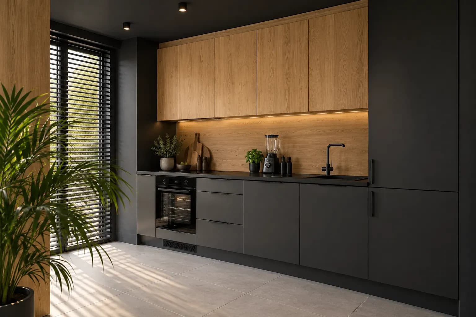
24 Oct 2026|5 min readKitchen interior design cost depends heavily on cabinet materials, core boards, hardware, storage accessories, and the level of customisation. Materials such as laminate, acrylic, veneer, membrane, and PU vary considerably in price, durability, appearance, and maintenance. A well-planned kitchen budget should therefore balance upfront cost with long-term performance and everyday use.
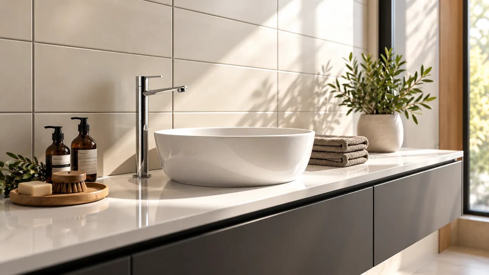
24 Oct 2026|5 min readAccessories, textures and finishes are all essential to modern bathroom decor, especially when smaller details need to feel connected. However, useful modern bathroom decor ideas also account for moisture, cleaning and storage so the room remains practical every day.
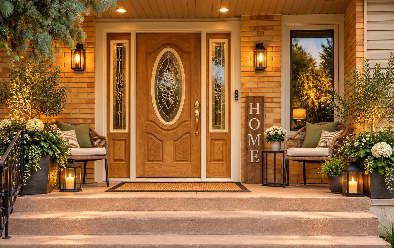
23 Oct 2026|5 min readMain door Vastu focuses on creating an entrance that feels balanced, welcoming, and functional through direction, placement, materials, colours, lighting, and everyday organisation. Even when changing the doorway is not practical, homeowners can use simple Vastu-aligned remedies such as better lighting, clutter-free storage, suitable finishes, plants, and traditional accents. The key is to combine Vastu principles with practical interior design so the entrance works comfortably for everyday life.
30 Sep 2026|5 min readLearn everything about pooja room Vastu, including how to create a compliant space in houses facing different directions and constraints.
14 Aug 2026|5 min readFind out the fundamentals of staircase Vastu, along with specific guidelines for east-facing houses, to create a functional home.
09 Aug 2026|5 min read


Your Home Makeover Starts Here.