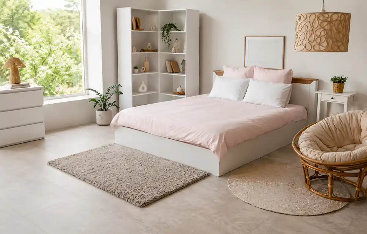
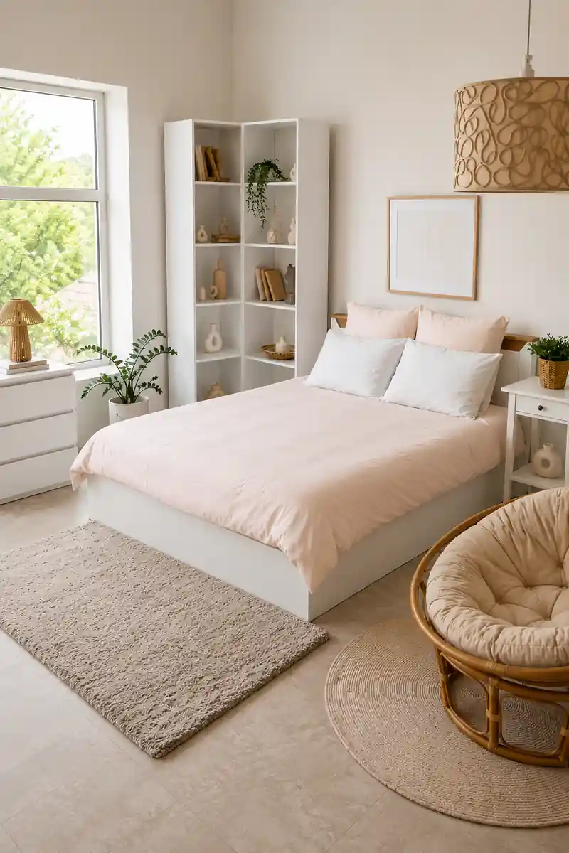



Pastel bedroom colours create a calm, airy, and contemporary atmosphere while helping smaller spaces feel brighter and more open. Shades such as sage green, blush pink, powder blue, peach, and muted yellow work best when chosen according to room size, natural light, furniture, and the desired mood. Pairing pastels with natural wood, textured fabrics, metallic accents, and deeper tones adds depth and prevents the space from feeling flat.
If you visit enough houses in Bangalore or Mumbai, you will see a pattern. The loudest bedrooms are rarely the ones that people truly enjoy spending time in. They are the ones that make you feel at ease as soon as you enter, where the colours don’t vie for your attention while still feeling purposeful and up to date.
That’s precisely where pastels make sense, not as a gentle, secure default, but as a truly astute option for a bedroom that needs to be calming without appearing outdated or unduly sensitive. Done right, pastel bedroom colours can make a room feel larger, calmer, and unmistakably contemporary.
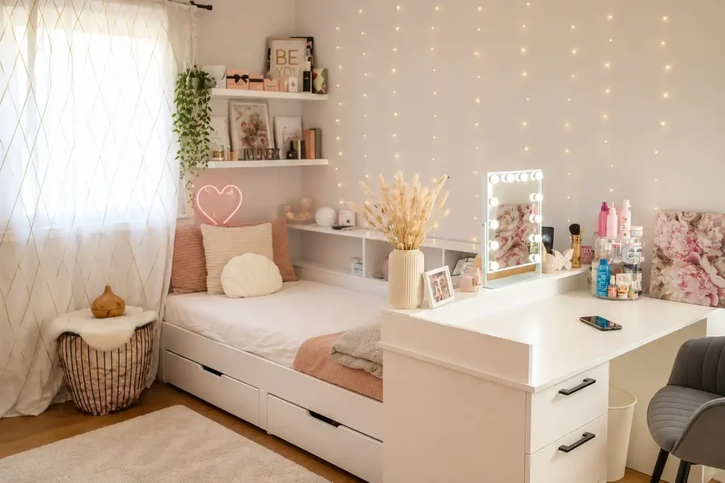
Beyond fads, pastels have a purpose in bedrooms. A room intended for relaxation is not overstimulated by soft pinks, blues, greens, yellows, and warm neutrals since they have a lower saturation than bright colours.
They also function so effectively for a pragmatic, physical reason:
Lighter tones bounce natural and artificial light around a room instead of absorbing it, which makes even a modestly sized bedroom feel more open.
Muted colours don’t force the eye to work, which supports the kind of calm a bedroom is actually meant for.
Because pastels are already diluted, they blend with neutrals, wood, and metallics without visual conflict.
A bedroom is one of the few rooms in a home built almost entirely around rest and recovery. Pastels support that function rather than working against it, which is exactly why they’ve held up as a serious design choice for bedroom colours.
Not every pastel suits every bedroom. The right shade depends on a few practical factors rather than personal taste alone.
| Factor | What to consider |
|---|---|
| Room size | Smaller rooms benefit from lighter, cooler pastels that open up the space |
| Natural light | North-facing or low-light rooms suit warmer pastels; bright rooms can carry cooler tones well |
| Existing furniture | Wood tones, metal finishes and existing upholstery should guide the undertone you pick |
| Desired mood | Warmer pastels feel cosy and grounding; cooler pastels feel fresh and airy |
As a general rule, warm pastels like blush pink, peach, and muted terracotta work well in rooms that get limited daylight, since they add a sense of warmth that compensates for the lack of sun. Cooler pastels like powder blue, sage green, and pale lilac suit bright, well-lit rooms, where they read as fresh and refreshing rather than cold.
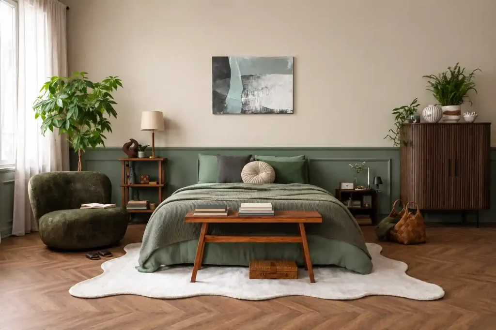
The classic pale pink and blue pairing still works, but pastel palettes have moved well beyond it. A few combinations that feel current rather than expected:
| Combination | Mood it creates |
|---|---|
| Pale pink and powder blue | Soft, classic, gently playful without feeling childish |
| Sage green and beige | Earthy, calm, close to nature |
| Powder blue and grey | Cool, contemporary, quietly sophisticated |
| Peach and cream | Warm, inviting, ideal for low-light rooms |
| Muted yellow and warm white | Light, cheerful, without being overpowering |
The key to keeping any of these contemporary is restraint. One dominant pastel with a supporting neutral almost always reads better than two or three pastels competing on equal footing.
Repainting an entire bedroom is a real commitment, and not everyone wants to start there. Fortunately, pastels don’t need a wall to make an impact.
A pastel duvet cover or pillowcases are the easiest, lowest-commitment way to test a colour before going further.
Soft-coloured curtains filter light beautifully and introduce colour without touching a single wall.
A pastel headboard becomes a soft focal point that anchors the whole room.
Small furniture pieces in a pastel finish add colour in a contained, easily changeable way.
Without making any long-term changes, a pastel rug grounds the space and provides warmth underfoot.
Instead of committing to a complete overhaul all at once, this tiered technique also makes it simple to build up a pastel bedroom gradually, piece by piece.
Using pastels without adequate contrast is more dangerous than choosing the incorrect shade. A room with only soft colours and no depth or texture tends to appear flat rather than serene.
A few ways to prevent that:
A pastel colour scheme is grounded and kept from looking overly airy by warm wood tones.
These textures give a modern, almost organic vibe while also adding visual interest.
A tiny metallic or dark accent on a mirror frame, drawer knobs, or lamp provides the eye with a point of contact.
Textured cushions, linen, and bouclé all contribute depth that flat pastel paint cannot.
One darker throw, cushion, or artwork prevents the space from feeling monotonous.
Diluting the pastel palette is not the aim. The purpose is to provide enough contrast so that the softness appears deliberate rather than accidental.
Pastels can be used in a variety of ways. They work nicely in a variety of modern design styles:
Keep things tidy and uncomplicated with a single pastel wall or bedspread placed against primarily white and neutral surfaces.
Sharp lines, metallic embellishments, and a largely neutral ground combine with pastels to create a contemporary look without going overboard.
The laid-back, subtle Scandinavian style is influenced by pale colours, light timber, linen textures, and lots of natural light.
Cane furniture, richly textured fabrics, and pastels combined with brass accents provide cosiness while maintaining a modern vibe.
Balance is what unites all of these. Although pastels set the tone, the style it ultimately serves is determined by the surrounding materials and accessories.
| Mistake | Why it doesn’t work |
|---|---|
| Using too many pastel shades at once | Competing soft tones cancel each other out and feel busy rather than calm |
| Choosing a colour without testing it in different light | A shade that looks great in a store can shift completely under your room’s actual lighting |
| Skipping texture altogether | Flat colour with no texture reads as dull rather than restful |
| Matching every surface too closely | Walls, bedding and furniture in near-identical tones erase depth and make the room feel one-dimensional |
The majority of these errors can be avoided before they become irreversible by testing paint or fabric samples in the real space at various times of day.
When a pastel colour scheme is selected for the person sleeping in the room rather than from a popular colour chart, it works best. This is the application of Bonito Designs’ LifeDesign methodology.
LifeDesign begins with how a person actually uses their bedroom, not with a colour. Do they want a place that is bright and invigorating since they wake up early? Do they require more cocooning and a warmer environment since they wind down late? Does the room receive a lot of afternoon light, or very little? Is storage a limitation that must be addressed to maintain the coherence of the palette?
Instead of using the same colour scheme for every bedroom, independent of the occupants, these responses help determine which pastel, which combination, and which materials actually make sense. As a result, the space feels serene because it was designed with that person’s sleeping style in mind, not just because it is painted a gentle hue.
Need help finding the right pastel bedroom colour? Book a consultation with Bonito Designs today!
Popular pastel bedroom colours include blush pink, sage green, powder blue, peach, pale lilac, and muted yellow. The best choice depends on your bedroom’s natural light, size, furniture, and the mood you want to create.
Yes, light pastel colours reflect more natural and artificial light, which can make a small bedroom feel brighter, more spacious, and visually open.
Warm pastels such as peach, blush pink, muted terracotta, and soft cream work well in bedrooms with limited natural light because they add warmth and prevent the room from feeling dull or cold.
You can introduce pastels through bedding, curtains, rugs, upholstered headboards, accent chairs, cushions, or bedside tables. These options allow you to experiment with colour without committing to a full repaint.
Use one dominant pastel with neutral colours and add contrast through natural wood, cane, rattan, brass, matte black accents, and textured fabrics. Avoid using too many pastel shades together, as this can make the room feel busy rather than calm.