Choosing paint colours for your home isn't really about picking a favourite shade off a card. It's about understanding how that colour will actually behave in your specific rooms, under your specific light, against your specific furniture and flooring. This guide walks through the full process, from the basics of colour theory to the types of paints worth knowing about, so the next repaint doesn't end in the same familiar disappointment.
A few practical factors should shape your decision before you fall in love with any particular shade:
Working through these basics first makes the actual colour selection far less overwhelming.
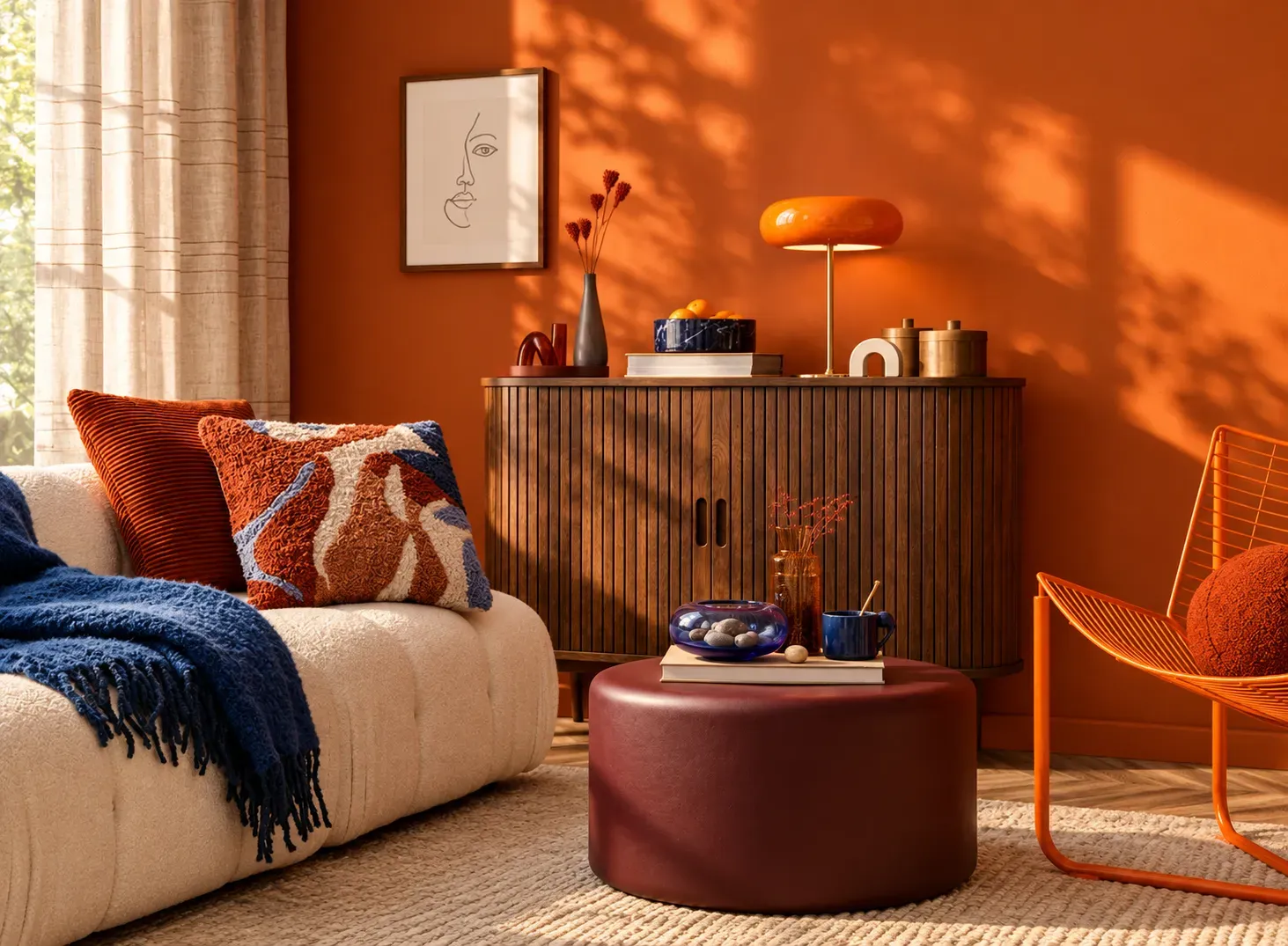
Every colour on a shade card falls broadly into one of these categories, and understanding the difference makes choosing a home interior colour far more intuitive.
| Category | Examples | Effect on a Room |
|---|---|---|
| Warm | Reds, oranges, yellows, warm browns | Feels cosy, energising, and inviting; can make a room feel smaller |
| Cool | Blues, greens, greys | Feels calm, spacious, and relaxing; can make a room feel larger and airier |
| Neutral | Whites, beiges, taupes, greiges | Feels versatile and timeless; adapts easily to furniture and accents |
| Accent | Any bold or saturated shade used sparingly | Adds energy and focus without overwhelming the whole room |
A well-balanced room typically leans on one dominant category, warm or cool, neutral as a base, and uses accent colours in small, deliberate doses rather than spreading several bold shades evenly across the space.
Different rooms serve different purposes, so the right palette should shift accordingly rather than applying one scheme across the whole home.
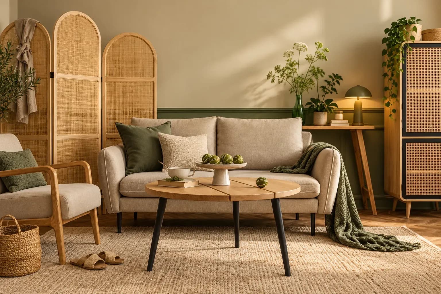
This is usually the most social space so it can handle a slightly bolder combination. Warm beige with brown accents, or soft grey with wood-tone furniture, both work well here and hold up across different lighting through the day.
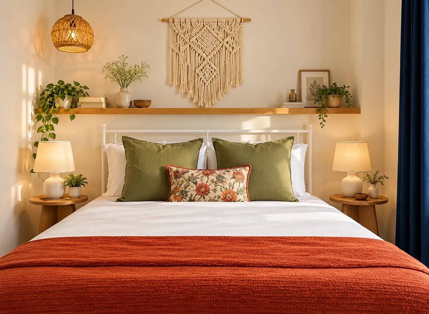
Calm should come first. Soft blues, sage greens, and muted neutrals support rest, especially when paired with a slightly warmer trim or headboard wall to avoid the room feeling too cold or clinical.
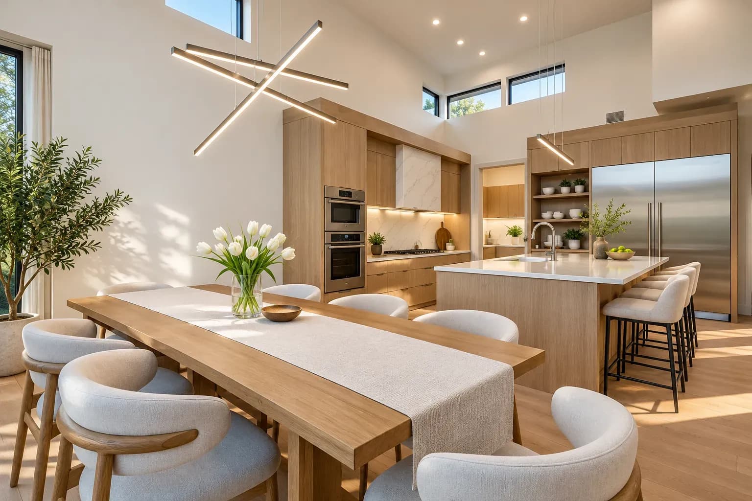
Durability and brightness both matter. Warm whites, soft greys, and light neutrals stay visually clean even with everyday wear and reflect kitchen lighting well.
A slightly richer tone than the surrounding space helps define the zone, especially in open-plan homes. Deep beige, warm terracotta, or a muted olive all work well as a defining home interior colour ideas choice for a dining wall.
Lighter, cohesive tones are almost always the safer route. Soft neutrals, pale blues, and gentle greens help a small room feel more open, particularly when the same palette continues into adjoining areas rather than changing abruptly.
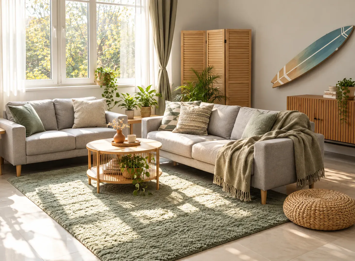
The single biggest reason a paint colour disappoints after application is lighting, not the colour itself. The same shade can look noticeably different depending on when and where you view it.
This is exactly why testing a paint sample directly on the actual wall, and viewing it at different times of day, matters more than judging a colour from a small swatch or a screen. A patch on the wall reveals how the shade behaves with your room's real light, which a paint chip can't replicate.
Colour is only half the decision. The finish you choose affects how that colour looks, how durable it is, and how easy it is to maintain.
| Finish | Characteristics | Best Suited For |
|---|---|---|
| Matte | Flat, no shine, hides minor wall imperfections well | Low-traffic rooms like bedrooms and formal living rooms |
| Eggshell | Slight sheen, more durable than matte | Living rooms, hallways with moderate use |
| Satin | Soft sheen, easy to wipe clean | Kitchens, dining areas, children's rooms |
| Washable/scrubbable finishes | Designed specifically for frequent cleaning without losing colour | High-traffic areas, kitchens, homes with young children or pets |
Among the broader types of wall paint, choosing the right paint colour for each room's traffic level matters as much as the colour itself, since a beautiful shade in the wrong finish can show marks, stains, or wear far faster than expected.
Choosing the right interior wall colour is about more than following trends or picking a shade you personally like. The best results come from balancing colour, lighting, room function, existing finishes, and paint type, so the final result feels visually cohesive and genuinely comfortable to live in, not just good on the day it was painted.
This is where Bonito Designs’ LifeDesign process comes in. This interior design service picks home colours based on how your family actually uses each room. Moreover, they consider the lighting, wall texture, home layout, and the local environment before finalising the finish. This forethought ensures your home remains beautiful and vibrant for years to come.
If you need a home designed around how you and your loved ones actually use the space, book a consultation with Bonito Designs today.
A well-planned small 2 BHK flat interior design should prioritise clear walkways before placing furniture or adding décor. Mapping natural movement paths, choosing appropriately scaled furniture, and using space-saving storage can make compact homes feel more comfortable and spacious. Consider daily routines, circulation, storage, and lifestyle needs together to create a home that works.
19 Oct 2026|5 min readA second bedroom in a 2 BHK can become far more useful when you plan it around everyday routines rather than keeping it only for occasional guests. Convertible furniture, smart storage, layered lighting, and flexible layouts can help the room support work, hobbies, fitness, or relaxation. By planning for both present needs and future changes, couples can create a multipurpose space that remains practical over time.
19 Oct 2026|5 min readA successful 2 BHK flat interior design project depends on clear scope, timely approvals, accurate measurements and proper sequencing of work. Plan procurement, modular production, and site execution around key dependencies to avoid delays. Regular reviews and systematic snag checks help keep the interior design project timeline on track.
17 Oct 2026|5 min readThoughtful villa interior design creates continuity across large homes without making every room look identical. Repeating select materials and colours, planning circulation, balancing social and private zones, and using lighting strategically can help each space feel connected. Also consider corridors, landings, storage, and room-specific needs as part of the overall plan.
16 Oct 2026|5 min readTop interior design for homes in Mumbai and Bangalore needs to respond to different space, lifestyle, and layout requirements. Mumbai homes often benefit from compact furniture, smart storage and lighter palettes, while Bangalore homes may allow greater flexibility with traditional, contemporary and luxury elements. Across both cities, good design comes down to planning each room around daily routines, circulation, storage and comfort.
06 Oct 2026|5 min readDIY interior design projects can give children a hands-on way to experiment, solve problems and make creative choices. Simple activities such as bird feeders, painted rocks, fairy gardens, desk organisers and bedroom bunting can support kids’ creativity without requiring expensive materials. Creating a safe, flexible workspace and displaying finished projects can make children feel more involved in shaping their surroundings.
06 Oct 2026|5 min read


Your Home Makeover Starts Here.