3 minute read.
When it comes to interior design, colour isn’t just a visual choice, it’s a psychological tool. The right palette can energise a living room, calm a bedroom, or bring warmth to a kitchen.
From muted neutrals to statement shades, colour has the power to shape both your interiors and your emotions. Here’s how to approach colour in home interiors with intent and impact.
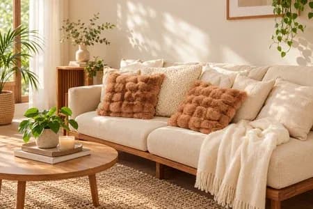
Beige, ivory, taupe, and soft greys are often considered the "safe zone" but that’s not a bad thing. These hues create a calming canvas and allow flexibility in styling.
Neutrals work well in minimalist interiors, open-plan layouts, or homes that lean toward organic and natural aesthetics.
Designer Tip: Layer multiple neutral tones for depth. Think warm greys with sand-coloured upholstery and natural wood flooring.
Terracotta, olive green, ochre, and clay tones have made a strong comeback in modern interiors. These colours bring a sense of groundedness and work beautifully in living rooms, dining areas, and transitional spaces.
Earth tones complement natural materials like wood, jute, and stone, making them perfect for interior styles such as Mediterranean, rustic modern, or Japandi.
Designer Tip: Use these shades on accent walls or cabinetry for warmth without overwhelming the room.
Rich hues like charcoal, forest green, navy, and burgundy add drama and depth. When used correctly, darker colours don’t shrink a space, they define it.
They’re ideal for home libraries, powder rooms, or even statement kitchens. Paired with the right lighting and textures, deep colours create a luxurious, cocooning feel in interiors.
Designer Tip: Matte finishes in dark tones feel more refined than glossy ones. Contrast with metallic fixtures or soft furnishings for balance.
Bold colours like mustard yellow, teal, or coral are perfect for homeowners who want to make a statement. These hues work well in spaces that need a creative lift, like kids' rooms, home offices, or entryways.
Designer Tip: Pick one bold hue and build your colour story around it. A feature wall, a coloured ceiling, or even vibrant cabinetry can create visual impact without clutter.
Pastels like powder blue, mint, blush pink, or lavender have evolved beyond nursery use. In modern interiors, they offer a soft, optimistic charm.
Pair pastels with clean lines, minimal furniture, and soft textiles to create an airy, balanced look.
Designer Tip: Use pastels with contrasting materials like black metal or dark wood to avoid a space feeling too saccharine.
Colour in interiors isn’t just about trends, it’s about how you want to feel in your space. Whether you're drawn to calming neutrals or expressive jewel tones, the key is choosing colours that support your lifestyle and personality.
We see colour not just as paint on the wall, but as the mood-maker of the home. The right palette can energise your mornings, soften your evenings, and create harmony across every room.
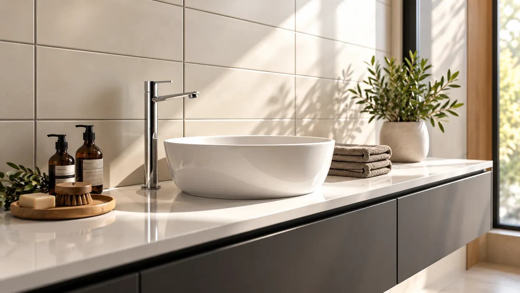
Accessories, textures and finishes are all essential to modern bathroom decor, especially when smaller details need to feel connected. However, useful modern bathroom decor ideas also account for moisture, cleaning and storage so the room remains practical every day.
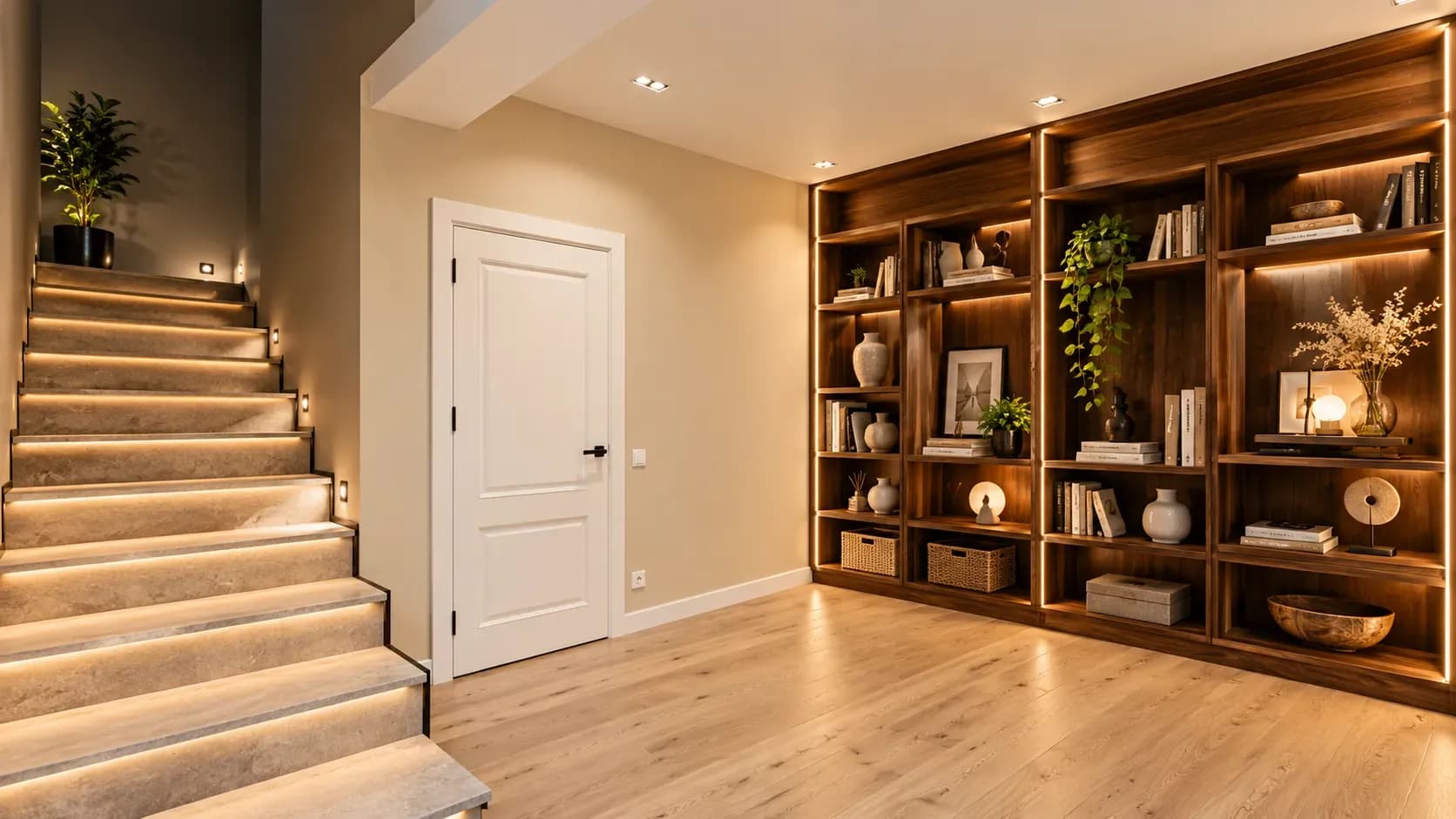
23 Oct 2026|5 min readA well-planned basement can become a practical extension of the home when moisture, ventilation, lighting and access are addressed first. From home theatres and gyms to guest rooms, offices and organised storage, basement interior design should reflect how the space will actually be used. Thoughtful layouts, moisture-resistant finishes and layered lighting can also make lower-ground spaces feel brighter, safer and more comfortable.
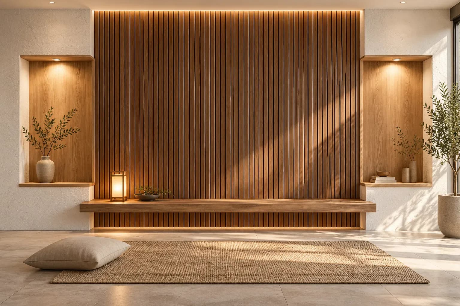
23 Oct 2026|5 min readWood and stone can both strengthen interior wall ideas by adding warmth, texture and depth, but their visual weight needs careful control. In a balanced wall design, one material can lead while the other supports it through smaller accents, matching undertones, and considered lighting.
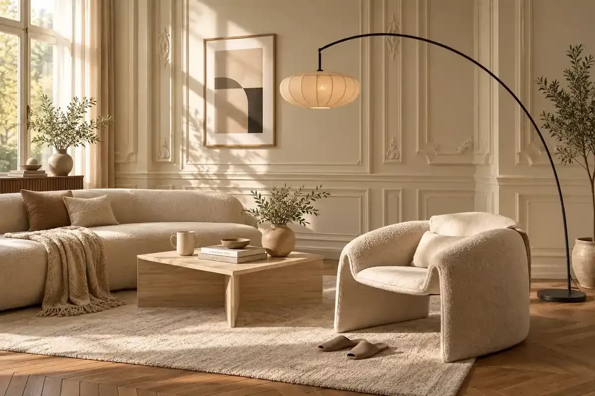
22 Oct 2026|5 min readPlan your living room furniture design with practical tips for choosing sofas, tables, rugs, storage and layouts that suit the way your household lives.
10 Sept 2026|5 min readDiscover how texture adds depth, warmth, and visual interest to interior design. Explore expert ideas to create stylish, layered spaces with Bonito Designs.
08 Sept 2026|5 min readDiscover 10 practical wall decoration ideas, from gallery walls and wallpaper to mirrors, panelling and greenery, that can completely transform a room.
27 Aug 2026|5 min read


Your Home Makeover Starts Here.